SaaS & Software Promotional Email Template
“How a Coframe test actually runs”
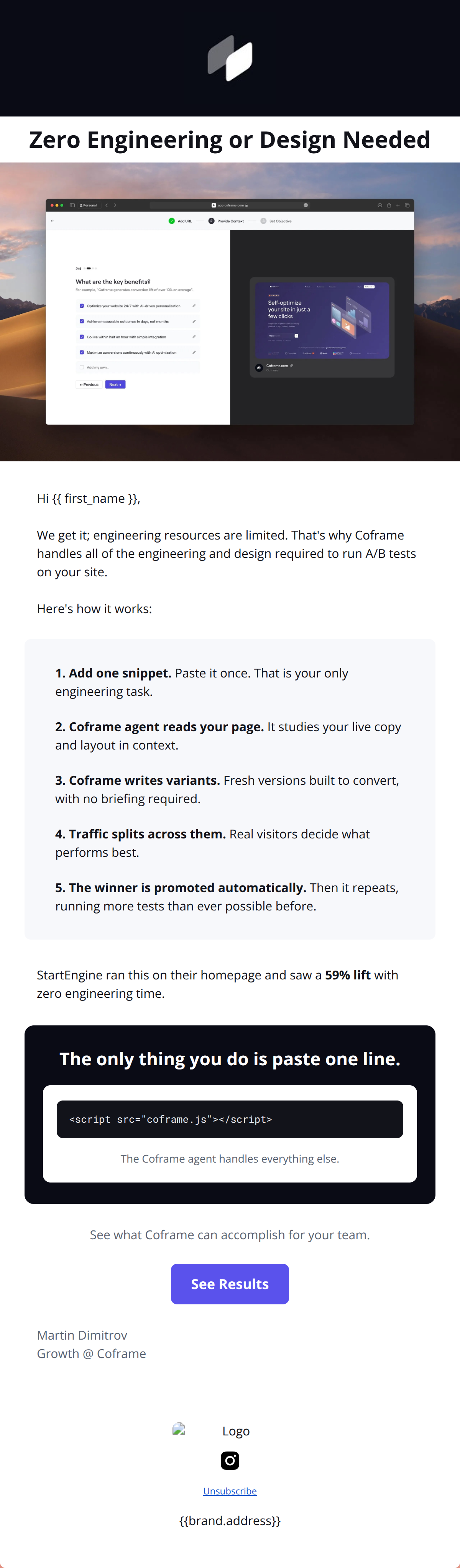
Design Score
92/100This is an outstanding example of a high-conversion B2B SaaS email. It masterfully targets a specific, high-friction pain point (engineering bottlenecks) and positions the product as the effortless solution. The narrative flow—from a punchy hook to a clear 'how it works' breakdown, followed by strong social proof and a definitive final action—creates a frictionless conversion path. While the copy is highly effective, it suffers from slight redundancy in the transition between the product features and the testimonial, and it over-relies on repeating the exact same phrase rather than varying the expression of the benefit.
Create Your Own
Generate professional email designs like this one in seconds with Kopi AI.
Email Details
- Subject Line
- How a Coframe test actually runs
- Brand
- Coframe
- Industry
- SaaS & Software
- Email Type
- Promotional
- Created
- September 4, 2026
Brand Colors
Email Copy
Preview text: One snippet is the only engineering task. The agent handles the rest, every week.
Zero Engineering or Design Needed
Hi ,
We get it; engineering resources are limited. That's why Coframe handles all of the engineering and design required to run A/B tests on your site. Here's how it works:
1. Add one snippet. Paste it once. That is your only engineering task.
2. Coframe agent reads your page. It studies your live copy and layout in context.
3. Coframe writes variants. Fresh versions built to convert, with no briefing required.
4. Traffic splits across them. Real visitors decide what performs best.
5. The winner is promoted automatically. Then it repeats, running more tests than ever possible before.
StartEngine ran this on their homepage and saw a 59% lift with zero engineering time.
See what Coframe can accomplish for your team.
→ See Results
Martin Dimitrov Growth @ Coframe
Unsubscribe
Why This Email Works
This is an outstanding example of a high-conversion B2B SaaS email. It masterfully targets a specific, high-friction pain point (engineering bottlenecks) and positions the product as the effortless solution. The narrative flow—from a punchy hook to a clear 'how it works' breakdown, followed by strong social proof and a definitive final action—creates a frictionless conversion path. While the copy is highly effective, it suffers from slight redundancy in the transition between the product features and the testimonial, and it over-relies on repeating the exact same phrase rather than varying the expression of the benefit.
Hero (top/initial part) Impact
92/100- Incredibly punchy, benefit-driven headline.
- Immediate contrast and visual focus on the primary value proposition.
- Strong color blocking creates a clear boundary for the opening hook.
Content Structure & Flow
90/100- Excellent inverted pyramid execution, guiding the reader from a high-level concept down to a specific action.
- The step-by-step breakdown bridges the gap between 'sounds too good to be true' and 'oh, I understand how this works'.
- The pacing of text vs. visuals keeps the reader engaged without feeling overwhelmed.
Visual Hierarchy & Layout
94/100- The use of the emerald green accent on step 5 perfectly highlights the ultimate benefit (automatic promotion).
- The custom code block in the final section provides an excellent visual anchor that reinforces the 'tech-savvy but easy' brand identity.
- Headings are consistently sized and effectively bolded to allow for rapid skimming.
Call-to-Action Strength
98/100- Relentless, consistent repetition of 'Add the snippet' creates zero cognitive load for the user.
- The final CTA inverts the colors (white button on primary purple background), drawing maximum attention at the bottom of the funnel.
- The CTA copy is action-oriented and specific to the product experience, vastly outperforming a generic 'Learn More'.
Message Clarity & Tone
96/100- Perfectly embodies the 'senior mentor' brand voice—direct, smart, and devoid of marketing fluff.
- Addresses the 'stop-and-go' development cycle pain point directly by emphasizing speed and autonomy.
Readability & Scannability
95/100- Excellent use of short, punchy sentences.
- The numbered list format reduces cognitive load and makes complex software mechanics feel simple.
- Generous line height and padding make the text highly legible.
Offer & Value Proposition
96/100- Transforms a complex technical product into a simple, highly desirable outcome (automatic weekly optimization).
- The 'one snippet' framing makes the adoption hurdle seem incredibly low.
Personalization & Audience Fit
97/100- Strategic use of industry-specific terms like 'sprint,' 'variants,' 'traffic splits,' and 'statistical winner'.
- Directly targets the frustration of relying on developers for minor UI tweaks.
Copy Conciseness & Word Economy
82/100- Avoids filler adjectives ('incredible', 'amazing').
- Steps 1-4 in the middle section are models of concise technical writing.
Quick Wins
- Delete the text block 'StartEngine ran this on their homepage...' located just above the testimonial card to eliminate the glaring repetition.
- Replace 1-2 instances of the exact phrase 'zero engineering time' with synonymous phrases (e.g., 'no dev ticket required') to maintain the message without sounding repetitive.




Create Professional Email Designs
Generate beautiful, on-brand email designs in seconds. Just enter your brand URL and let AI do the rest.