Food & Beverage Promotional Email Template
“Help mee: overschot zomerfruit, 20% korting 🥭”
Design Score
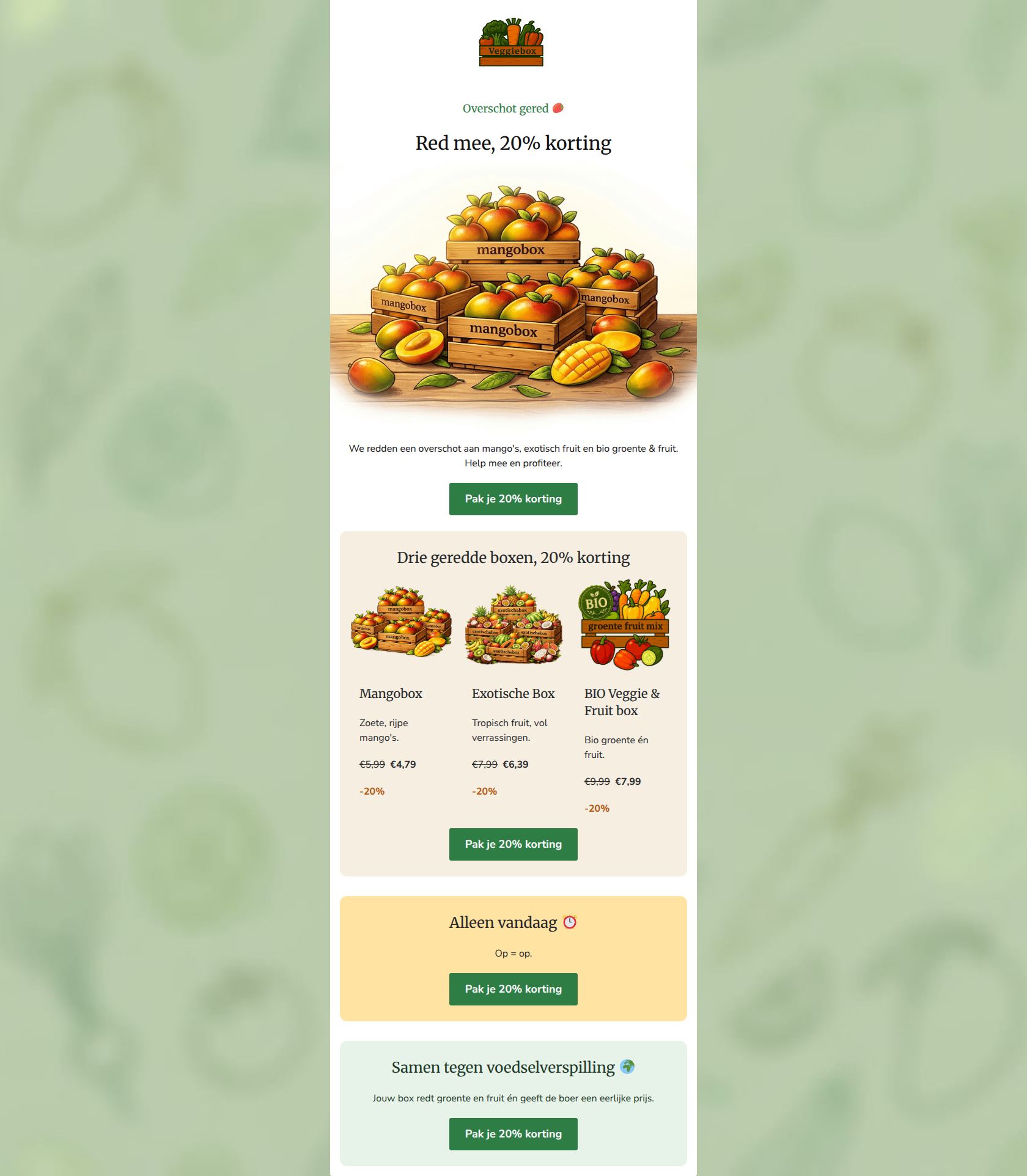
87/100This is a highly effective, focused promotional email that clearly communicates its dual value proposition: saving money and fighting food waste. The structure is logical, the offer is compelling, and the strict repetition of a single, clear Call-to-Action is excellent for driving clicks. The primary missed opportunity lies in visual authenticity; for a brand selling 'imperfect' produce, the hyper-polished, likely AI-generated hero image contradicts the 'documentary-style' brand guidelines and may reduce trust. Minor layout tweaks to pricing display and text alignment will push this into the top tier.
Create Your Own
Generate professional email designs like this one in seconds with Kopi AI.
Email Details
- Subject Line
- Help mee: overschot zomerfruit, 20% korting 🥭
- Brand
- Veggiebox
- Industry
- Food & Beverage
- Email Type
- Promotional
- Created
- July 1, 2026
Brand Colors
Email Copy
Preview text: Geredde mango's, exotisch fruit & bio groente/fruit met 20% korting. Help ons dit overschot redden. Op = op! 🥭
Overschot gered 🥭
Red mee, 20% korting
We redden een overschot aan mango's, exotisch fruit en bio groente & fruit. Help mee en profiteer.
→ Pak je 20% korting
Drie geredde boxen, 20% korting
Mangobox
Zoete, rijpe mango's.
€5,99 €4,79
-20%
Exotische Box
Tropisch fruit, vol verrassingen.
€7,99 €6,39
-20%
BIO Veggie & Fruit box
Bio groente én fruit.
€9,99 €7,99
-20%
→ Pak je 20% korting
Alleen vandaag ⏰
Op = op.
→ Pak je 20% korting
Samen tegen voedselverspilling 🌍
Jouw box redt groente en fruit én geeft de boer een eerlijke prijs.
→ Pak je 20% korting
Why This Email Works
This is a highly effective, focused promotional email that clearly communicates its dual value proposition: saving money and fighting food waste. The structure is logical, the offer is compelling, and the strict repetition of a single, clear Call-to-Action is excellent for driving clicks. The primary missed opportunity lies in visual authenticity; for a brand selling 'imperfect' produce, the hyper-polished, likely AI-generated hero image contradicts the 'documentary-style' brand guidelines and may reduce trust. Minor layout tweaks to pricing display and text alignment will push this into the top tier.
Hero (top/initial part) Impact
85/100- Immediate introduction of the 20% discount offer.
- Clear contextual hook ('Overschot gered').
- Strong color contrast for the primary CTA button.
Content Structure & Flow
90/100- Logical progression from main offer to specific products.
- Effective use of background panels to chunk information.
- Frictionless path to the CTA at every scroll depth.
Visual Hierarchy & Layout
80/100- Clear delineation between sections using brand-appropriate background colors.
- Good use of bolding to highlight the final price.
- Product images are consistently sized and cropped.
Call-to-Action Strength
98/100- Flawless repetition of the primary conversion goal.
- Action-oriented, benefit-driven button copy.
- High visual contrast ensures the buttons pass the 'squint test'.
Message Clarity & Tone
88/100- Excellent alignment with brand values and customer psychographics.
- Use of emojis feels natural and friendly, not forced.
- Clear framing of the discount as a joint effort ('Red mee').
Readability & Scannability
85/100- Short, punchy headings.
- Bullet-style brevity in the product descriptions.
- Clear typography with appropriate use of bolding.
Offer & Value Proposition
92/100- Transparent and easily calculated offer.
- Ethical and financial value propositions are interwoven seamlessly.
- Effective use of visual anchors (strike-throughs) to show value.
Personalization & Audience Fit
85/100- Deeply resonant messaging for eco/budget-conscious consumers.
- Positioning the customer as a hero ('Jouw box redt groente').
Copy Conciseness & Word Economy
90/100- Zero filler language.
- Product descriptions are hyper-concise (e.g., 'Zoete, rijpe mango's.').
- Headings do the heavy lifting for communication.
Quick Wins
- Move the 'Alleen vandaag ⏰' urgency text up into the hero section to establish immediate FOMO.
- Group the original price, sale price, and discount badge tightly together on the product cards to reduce visual hunting.
- Center-align the text within the product cards to create a smoother vertical scan path that matches the rest of the email.


Create Professional Email Designs
Generate beautiful, on-brand email designs in seconds. Just enter your brand URL and let AI do the rest.