SaaS & Software Promotional Email Template
“Genesis AI builds your business hub instantly”
Design Score
87/100This is a highly effective, well-structured promotional email that understands its audience and core objective. The narrative flow from the all-in-one hook down to the brilliant Zero Risk objection-handling section is psychologically sound. The disciplined, repetitive CTA strategy is exactly what drives conversions. The primary issues holding this back from a perfect score are minor visual execution flaws, specifically low-contrast text in the features section and some slight visual disconnects in how the background blocks transition. Fix the contrast, and this is a top-tier asset.
Create Your Own
Generate professional email designs like this one in seconds with Kopi AI.
Email Details
- Subject Line
- Genesis AI builds your business hub instantly
- Brand
- Income Stream Pro
- Industry
- SaaS & Software
- Email Type
- Promotional
- Created
- April 21, 2026
Brand Colors
Email Copy
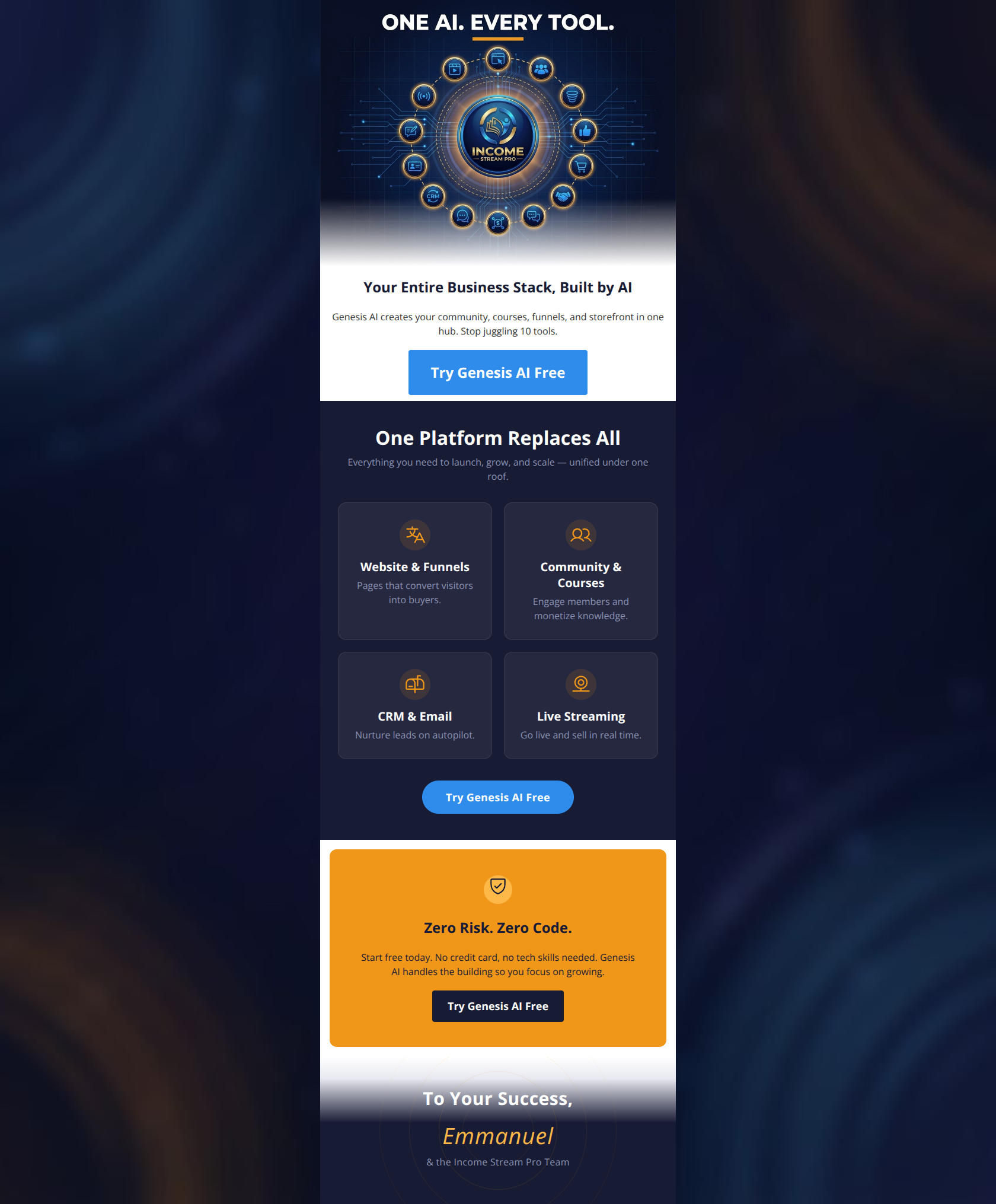
Your Entire Business Stack, Built by AI
Genesis AI creates your community, courses, funnels, and storefront in one hub. Stop juggling 10 tools.
→ Try Genesis AI Free
Zero Risk. Zero Code.
Start free today. No credit card, no tech skills needed. Genesis AI handles the building so you focus on growing.
→ Try Genesis AI Free
Why This Email Works
This is a highly effective, well-structured promotional email that understands its audience and core objective. The narrative flow from the all-in-one hook down to the brilliant Zero Risk objection-handling section is psychologically sound. The disciplined, repetitive CTA strategy is exactly what drives conversions. The primary issues holding this back from a perfect score are minor visual execution flaws, specifically low-contrast text in the features section and some slight visual disconnects in how the background blocks transition. Fix the contrast, and this is a top-tier asset.
Hero Impact
85/100- The hero graphic immediately establishes the all-in-one value proposition visually.
- The headline is entirely benefit-driven, focusing on the outcome rather than the tool.
Content Structure & Flow
92/100- Employs a perfect inverted pyramid structure: Hook to Features to Risk Reversal to Final push.
- The Zero Risk block acts as an excellent standalone module that logically addresses friction points exactly when the user is deciding whether to click.
Visual Hierarchy & Layout
84/100- The 2x2 grid for features is highly scannable and prevents the user from being bogged down in a wall of text.
- The orange block acts as a massive visual anchor, pulling the eye exactly where you want it.
Call-to-Action Strength
95/100- Flawless execution of the CTA repetition rule. The exact same copy is used three times, pointing to the exact same goal.
- Buttons use high-contrast color choices to ensure they pop in every section.
Message Clarity & Tone
90/100- The 'Stop juggling 10 tools' line perfectly identifies the user's primary pain point.
- The tone is confident, direct, and authoritative, perfectly matching the aspirational brand guidelines.
Readability & Scannability
78/100- Excellent use of headings and short, punchy sentences.
- Generous padding around the text elements prevents visual crowding.
Offer & Value Proposition
88/100- The Zero Risk section is a masterclass in objection handling.
- The core offer of consolidation via AI is highly compelling for the target audience.
Personalization & Audience Fit
85/100- The copy directly targets the specific operational headaches of digital entrepreneurs.
- The visual aesthetic feels premium and sophisticated, matching the wealth creation audience vibe.
Copy Conciseness & Word Economy
94/100- Zero filler words. Every sentence drives the narrative forward.
- Microcopy like 'Zero Risk. Zero Code.' communicates massive value in four words.
Quick Wins
- Brighten the body text inside the dark navy feature cards to significantly improve contrast and readability.
- Increase the visual weight (stroke thickness or size) of the orange icons in the features section so they stand out more.
- Add a tiny microcopy line under the final CTA button (e.g., 'No credit card required') to reinforce the risk reversal right at the point of click.




Create Professional Email Designs
Generate beautiful, on-brand email designs in seconds. Just enter your brand URL and let AI do the rest.