Food & Beverage Promotional Email Template
“Fuel Your Next Win”
Design Score
83/100This email is a strong, visually striking execution of Gatorade's brutalist minimalism brand identity. It excels in visual hierarchy, scannability, and CTA consistency. However, it functions more as a brand awareness poster than a high-converting direct response email due to the lack of a specific offer, urgency, or targeted personalization. It will perform competently on brand strength alone, but leaves money on the table by not giving the reader a compelling reason to act today.
Create Your Own
Generate professional email designs like this one in seconds with Kopi AI.
Email Details
- Subject Line
- Fuel Your Next Win
- Brand
- Gatorade
- Industry
- Food & Beverage
- Email Type
- Promotional
- Created
- June 11, 2026
Brand Colors
Email Copy
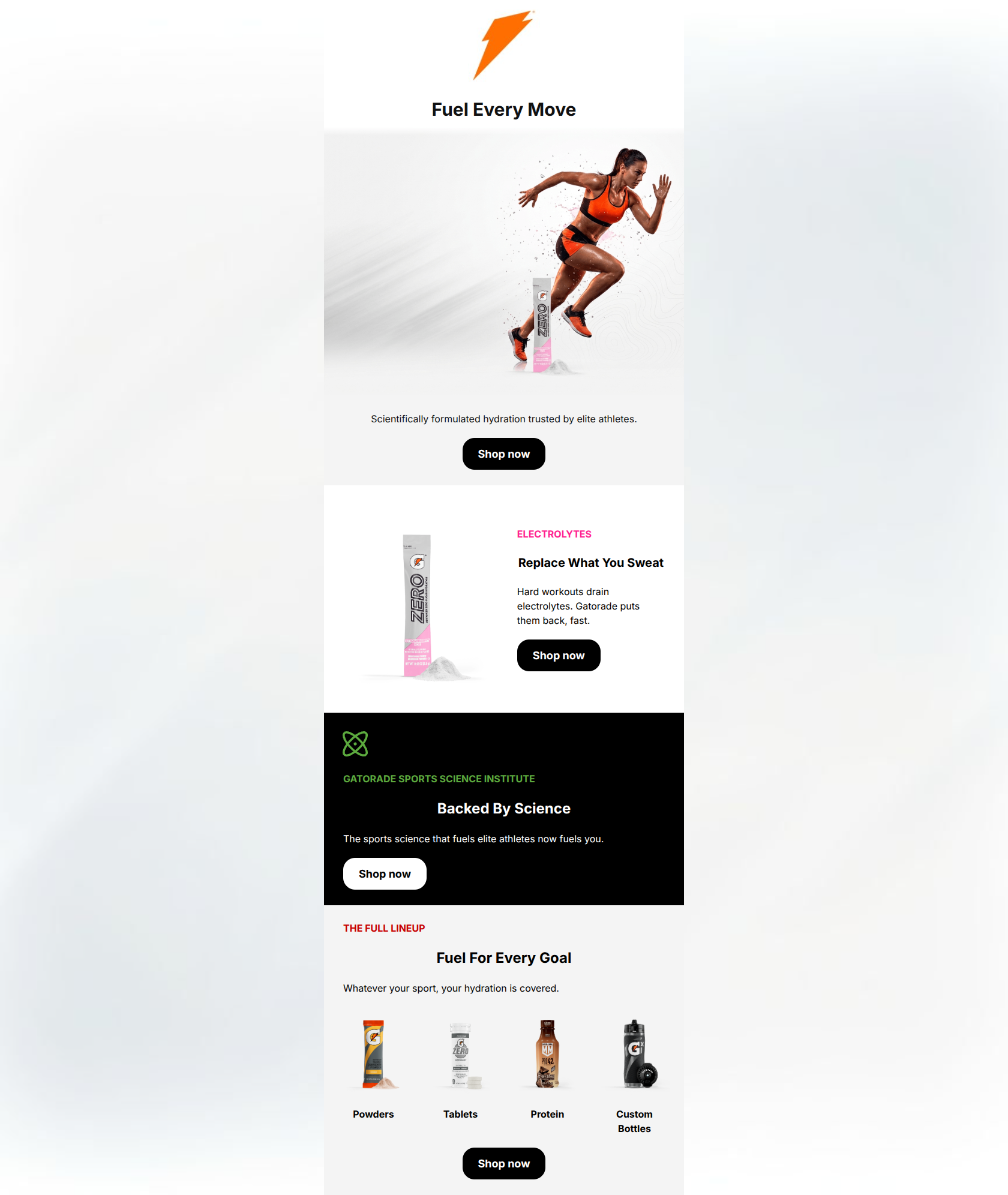
Fuel Every Move
Scientifically formulated hydration trusted by elite athletes.
→ Shop now
ELECTROLYTES
Replace What You Sweat
Hard workouts drain electrolytes. Gatorade puts them back, fast.
→ Shop now
GATORADE SPORTS SCIENCE INSTITUTE
Backed By Science
The sports science that fuels elite athletes now fuels you.
→ Shop now
THE FULL LINEUP
Fuel For Every Goal
Whatever your sport, your hydration is covered.
Powders
Tablets
Protein
Custom Bottles
→ Shop now
Why This Email Works
This email is a strong, visually striking execution of Gatorade's brutalist minimalism brand identity. It excels in visual hierarchy, scannability, and CTA consistency. However, it functions more as a brand awareness poster than a high-converting direct response email due to the lack of a specific offer, urgency, or targeted personalization. It will perform competently on brand strength alone, but leaves money on the table by not giving the reader a compelling reason to act today.
Hero Impact
82/100- Striking, high-quality imagery that captures the brand's athletic energy.
- Punchy, action-oriented headline.
Content Structure & Flow
80/100- Logical progression from brand level to specific benefit to product catalog.
- Distinct background colors successfully compartmentalize different sections for easy reading.
Visual Hierarchy & Layout
85/100- Excellent use of stark contrast to define clear content hierarchy.
- High-contrast backgrounds make the CTAs impossible to miss.
Call-to-Action Strength
95/100- A single, clear primary action ('Shop now') is repeated consistently.
- All buttons point to the primary destination without introducing competing actions.
- Exceptional contrast on both light and dark backgrounds.
Message Clarity & Tone
85/100- Tone perfectly matches the brand's authoritative voice.
- 'Replace What You Sweat' is a superb, customer-centric benefit statement.
Readability & Scannability
92/100- Sentences are short, punchy, and highly digestible.
- Brightly colored kickers (pink, green, red) provide excellent visual anchors for the scanning eye.
Offer & Value Proposition
68/100- Strong reinforcement of the core brand promise.
Personalization & Audience Fit
72/100- Imagery and tone resonate deeply with the active, performance-driven psychographic.
Copy Conciseness & Word Economy
88/100- Zero throat-clearing or filler words used.
- Benefits are communicated with maximum impact and minimum word count.
Quick Wins
- Increase the size of the product imagery in the 'Full Lineup' grid to make them visually heavier and more recognizable.
- Remove the repetitive 'elite athletes' messaging from the hero subhead, reserving that angle strictly for the 'Backed by Science' section.
- Adjust the layout of the 50/50 section to better balance the tall product image with the short copy block, perhaps by incorporating a secondary graphical element.


Create Professional Email Designs
Generate beautiful, on-brand email designs in seconds. Just enter your brand URL and let AI do the rest.