Media & Entertainment Newsletter Email Template
“Expert Insights Await!”
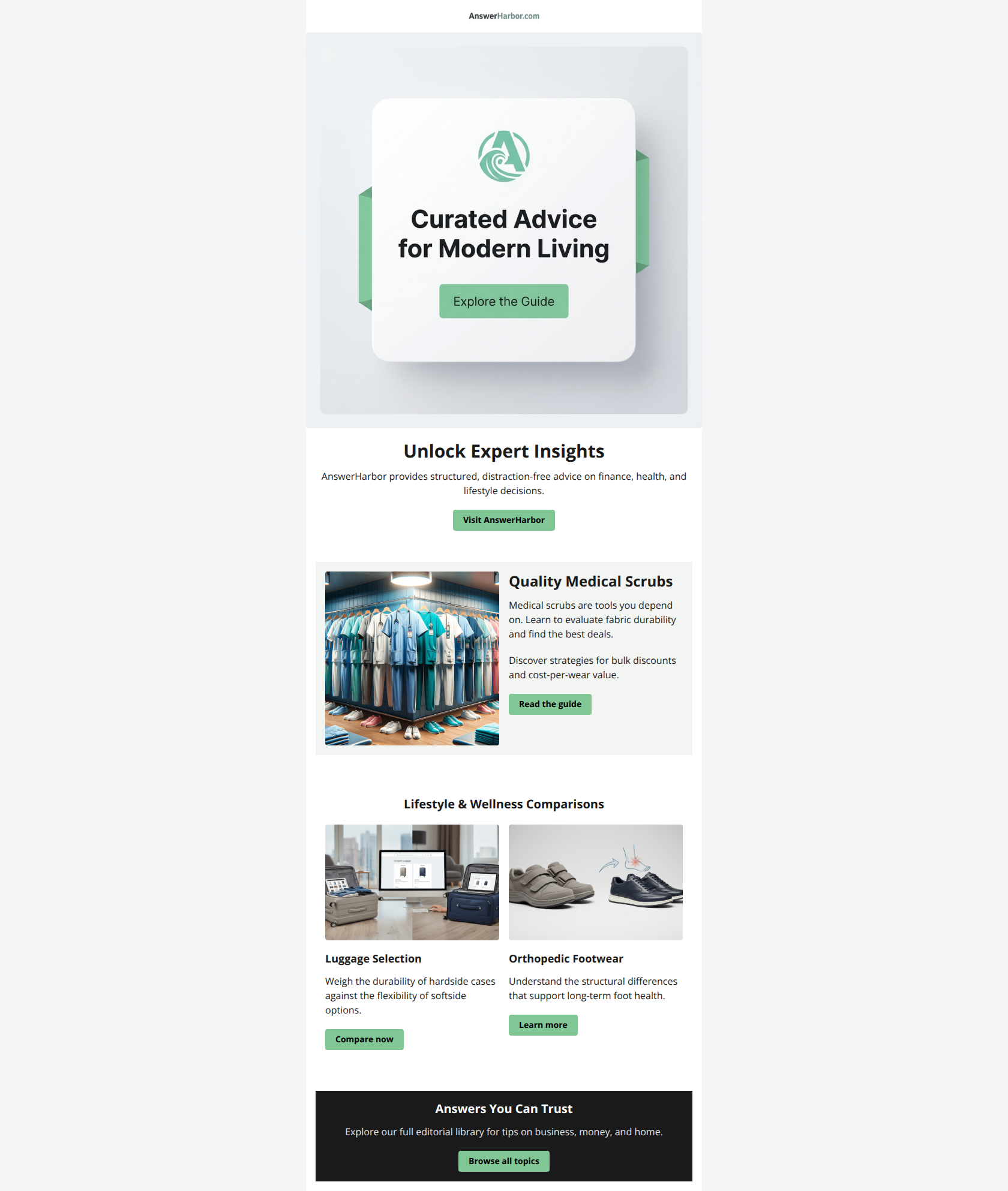
Design Score
70/100This email features a clean, professional aesthetic with high readability, but it suffers from a "homepage mindset" rather than a conversion-focused narrative. The biggest strength is the clear, benefit-driven copy in the feature section (Medical Scrubs), which effectively sells the value of the click. The biggest weakness is the Hero section, which wastes prime real estate on a generic brand statement and a confusing visual duplicate of the CTA, rather than hooking the reader with the specific content immediately available.
Create Your Own
Generate professional email designs like this one in seconds with Kopi AI.
Email Details
- Subject Line
- Expert Insights Await!
- Brand
- AnswerHarbor
- Industry
- Media & Entertainment
- Email Type
- Newsletter
- Created
- December 29, 2025
Brand Colors
Email Copy
Unlock Expert Insights
AnswerHarbor provides structured, distraction-free advice on finance, health, and lifestyle decisions.
→ Visit AnswerHarbor
Quality Medical Scrubs
Medical scrubs are tools you depend on. Learn to evaluate fabric durability and find the best deals.
Discover strategies for bulk discounts and cost-per-wear value.
→ Read the guide
Lifestyle & Wellness Comparisons
Luggage Selection
Weigh the durability of hardside cases against the flexibility of softside options.
→ Compare now
Orthopedic Footwear
Understand the structural differences that support long-term foot health.
→ Learn more
Answers You Can Trust
Explore our full editorial library for tips on business, money, and home.
→ Browse all topics
Why This Email Works
This email features a clean, professional aesthetic with high readability, but it suffers from a "homepage mindset" rather than a conversion-focused narrative. The biggest strength is the clear, benefit-driven copy in the feature section (Medical Scrubs), which effectively sells the value of the click. The biggest weakness is the Hero section, which wastes prime real estate on a generic brand statement and a confusing visual duplicate of the CTA, rather than hooking the reader with the specific content immediately available.
Hero Impact
60/100- High-quality imagery that aligns with the brand aesthetic.
- Clear brand identification at the very top.
Content Structure & Flow
75/100- The hierarchy of Primary Feature (Scrubs) -> Secondary Grid (Luggage/Shoes) works well for scanning.
- Distinct section breaks using background colors aid the flow.
Visual Hierarchy & Layout
70/100- Excellent use of whitespace and padding ensures nothing feels cramped.
- Card-based design effectively compartmentalizes different topics.
Call-to-Action Strength
65/100- Primary and secondary buttons are visually distinct in size.
- The 'Compare now' CTA is a good example of an active, specific verb.
Message Clarity & Tone
80/100- The 'Medical Scrubs' body copy perfectly summarizes the 'what' (durability) and the 'why' (cost savings) in just two sentences.
- Tone is consistently authoritative and trustworthy.
Readability & Scannability
85/100- High-contrast black text on white/grey backgrounds is perfect for readability.
- Headlines utilize a clear hierarchy (H1 vs H2 vs H3).
Offer & Value Proposition
70/100- The Scrubs section clearly articulates the financial benefit (bulk discounts, cost-per-wear) of reading the article.
Personalization & Audience Fit
50/100- N/A - The content feels like a generic digest without specific audience targeting visible.
Quick Wins
- Edit the Hero image to remove the 'Explore the Guide' button graphic, eliminating the confusion of a non-clickable 'button'.
- Rename the Hero CTA from 'Visit AnswerHarbor' to 'See Latest Advice' to drive action.
- Add a bold subhead 'Featured Story' above the Scrubs section to aid scanning.

Create Professional Email Designs
Generate beautiful, on-brand email designs in seconds. Just enter your brand URL and let AI do the rest.