Food & Beverage Product Launch Email Template
“Eindelijk: de Veggie & Fruit Mix is er!”
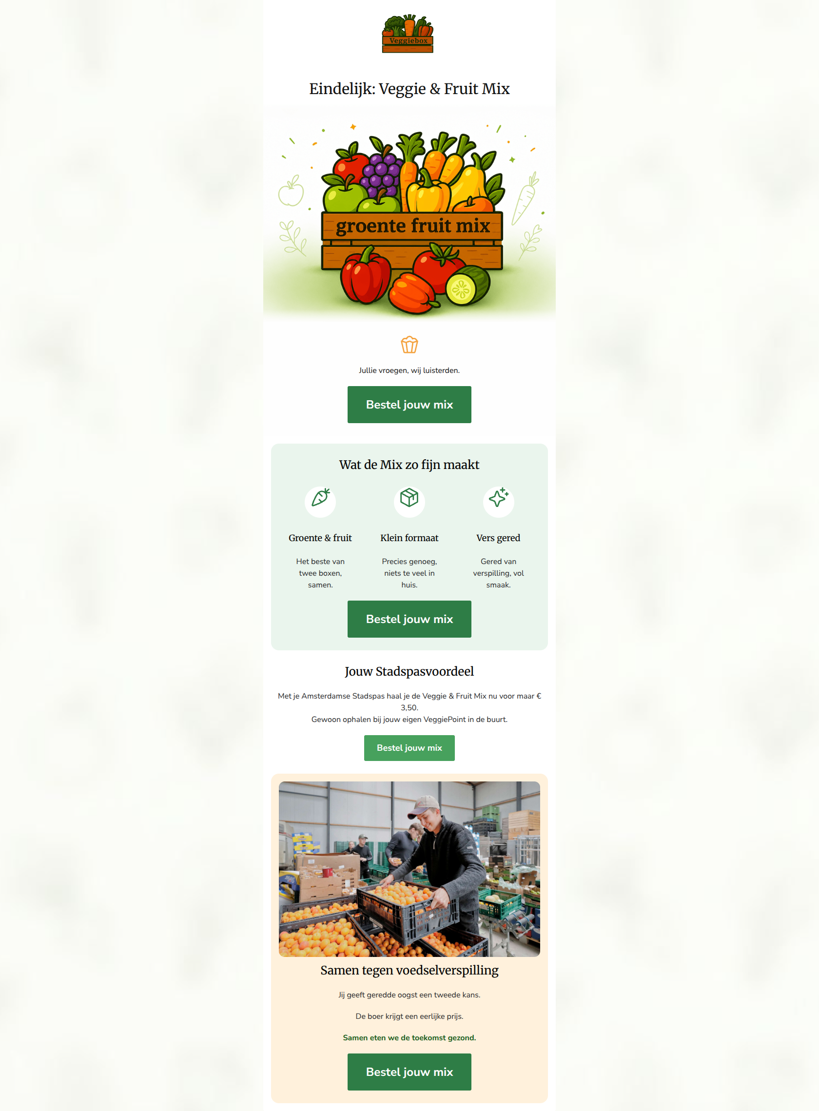
Design Score
80/100This is a structurally sound product launch email that effectively uses clear sections, alternating background colors, and a highly consistent Call-to-Action strategy to drive clicks. The primary strengths are its scannability, concise copy in the benefits section, and the unambiguous CTA repetition. However, the email leaves conversion potential on the table by fracturing the hero section and burying the strongest offer (the €3,50 Stadspas price) halfway down the page. Tightening the top of the email to immediately present the value proposition will improve the click-through rate.
Create Your Own
Generate professional email designs like this one in seconds with Kopi AI.
Email Details
- Subject Line
- Eindelijk: de Veggie & Fruit Mix is er!
- Brand
- Veggiebox
- Industry
- Food & Beverage
- Email Type
- Product Launch
- Created
- June 22, 2026
Brand Colors
Email Copy
Eindelijk: Veggie & Fruit Mix
Jullie vroegen, wij luisterden.
→ Bestel jouw mix
Wat de Mix zo fijn maakt
Groente & fruit
Het beste van twee boxen, samen.
Klein formaat
Precies genoeg, niets te veel in huis.
Vers gered
Gered van verspilling, vol smaak.
→ Bestel jouw mix
Jouw Stadspasvoordeel
Met je Amsterdamse Stadspas haal je de Veggie & Fruit Mix nu voor maar € 3,50. Gewoon ophalen bij jouw eigen VeggiePoint in de buurt.
→ Bestel jouw mix
Samen tegen voedselverspilling
Jij geeft geredde oogst een tweede kans.
De boer krijgt een eerlijke prijs.
Samen eten we de toekomst gezond.
→ Bestel jouw mix
Why This Email Works
This is a structurally sound product launch email that effectively uses clear sections, alternating background colors, and a highly consistent Call-to-Action strategy to drive clicks. The primary strengths are its scannability, concise copy in the benefits section, and the unambiguous CTA repetition. However, the email leaves conversion potential on the table by fracturing the hero section and burying the strongest offer (the €3,50 Stadspas price) halfway down the page. Tightening the top of the email to immediately present the value proposition will improve the click-through rate.
1. Hero (top/initial part) Impact
70/100- Clear, unambiguous headline that announces the new offering immediately.
- The illustration clearly depicts the product's contents (a mix of fruits and vegetables).
2. Content Structure & Flow
82/100- Excellent use of background color changes to define distinct content sections.
- Logical progression from 'What it is' to 'Why it's good' to 'Why it matters'.
3. Visual Hierarchy & Layout
78/100- The 3-column layout for 'Wat de Mix zo fijn maakt' is perfectly proportioned and easy to scan.
- Rounded corners on the section containers soften the utilitarian aesthetic, fitting the approachable brand tone.
4. Call-to-Action Strength
95/100- Perfect repetition of the primary goal.
- High-contrast green buttons (#2E7D46) stand out clearly against all background colors used.
5. Message Clarity & Tone
85/100- The mission statement at the bottom connects the purchase to a larger purpose ('Samen eten we de toekomst gezond') without being overly preachy.
- Clear explanation of the product's functional benefits (small size, mixed contents).
6. Readability & Scannability
88/100- Excellent use of iconography to anchor the 3-column text.
- Ample whitespace within the colored cards prevents the content from feeling cramped.
7. Offer & Value Proposition
75/100- The value proposition of 'rescued food' + 'smaller size' + 'mixed variety' is a compelling combination for the target audience.
8. Personalization & Audience Fit
80/100- Directly addresses practical barriers to entry (size/amount of food).
- Localized offers reinforce the community pick-up point model.
9. Copy Conciseness & Word Economy
85/100- No long, rambling paragraphs.
- Every bullet point in the benefits section earns its place.
Quick Wins
- Delete the section containing the 'party-popper' icon and the text 'Jullie vroegen, wij luisterden'.
- Move the first 'Bestel jouw mix' CTA directly underneath the hero image to create a tighter conversion funnel at the top of the email.
- Bold the '€3,50' text in the Stadspas section to make the specific offer pop visually.


Create Professional Email Designs
Generate beautiful, on-brand email designs in seconds. Just enter your brand URL and let AI do the rest.