Health & Wellness Product Launch Email Template
“Early Access: Micro-dose Sleep is here 🌙”
Design Score
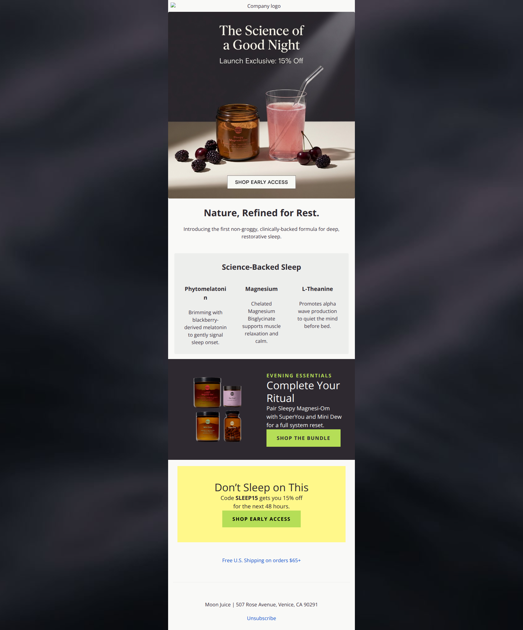
81/100This is a strong, visually premium product launch email that effectively communicates the brand's 'science-meets-nature' positioning. The narrative flow—from problem/solution to ingredients to a bundle cross-sell—is excellent and builds a compelling case for the click. However, the email suffers from a noticeable typography error in the ingredients section and relies too heavily on text baked into the hero image, which risks accessibility and rendering issues.
Create Your Own
Generate professional email designs like this one in seconds with Kopi AI.
Email Details
- Subject Line
- Early Access: Micro-dose Sleep is here 🌙
- Brand
- Moon Juice
- Industry
- Health & Wellness
- Email Type
- Product Launch
- Created
- February 22, 2026
Brand Colors
Email Copy
Nature, Refined for Rest.
Introducing the first non-groggy, clinically-backed formula for deep, restorative sleep.
Science-Backed Sleep
Phytomelatonin
Brimming with blackberry-derived melatonin to gently signal sleep onset.
Magnesium
Chelated Magnesium Bisglycinate supports muscle relaxation and calm.
L-Theanine
Promotes alpha wave production to quiet the mind before bed.
Free U.S. Shipping on orders $65+
Moon Juice | 507 Rose Avenue, Venice, CA 90291
Unsubscribe
Why This Email Works
This is a strong, visually premium product launch email that effectively communicates the brand's 'science-meets-nature' positioning. The narrative flow—from problem/solution to ingredients to a bundle cross-sell—is excellent and builds a compelling case for the click. However, the email suffers from a noticeable typography error in the ingredients section and relies too heavily on text baked into the hero image, which risks accessibility and rendering issues.
Hero Impact
85/100- Strong, mood-setting photography that elevates the product perception.
- Clear value proposition ('Launch Exclusive: 15% Off') placed prominently.
Content Structure & Flow
90/100- Logical progression from emotional hook to rational proof (ingredients) to commercial upsell.
- Distinct section breaks allow the reader to mentally categorize information easily.
Visual Hierarchy & Layout
75/100- Good use of background colors (White vs. Grey vs. Dark vs. Yellow) to separate thematic sections.
- Central alignment keeps the eye focused down the middle of the page.
Call-to-Action Strength
78/100- High contrast buttons that pass the squint test.
- Multiple entry points (Single product vs. Bundle vs. General Offer).
Message Clarity & Tone
90/100- Excellent use of specific benefits ('non-groggy', 'alpha wave production').
- Tone feels premium and expert-driven.
Readability & Scannability
75/100- Short, punchy descriptions for the ingredients.
- Good use of negative space around headlines.
Offer & Value Proposition
85/100- Clear incentive (15% Off).
- Urgency is reinforced with 'next 48 hours' in the footer banner.
Personalization & Audience Fit
70/100- Product selection aligns perfectly with the target demographic's interest in bio-hacking and natural health.
Quick Wins
- Fix the typography bug where 'Phytomelatonin' breaks awkwardly onto two lines ('Phytomelatoni n').
- Add the text 'Code: SLEEP15' directly under the Hero CTA button so users know how to redeem the 15% off immediately.
- Narrow the text container for the 'Nature, Refined for Rest' paragraph to improve readability.
- Change the yellow banner CTA from 'Shop Early Access' to 'Claim My 15% Off' to be more action-oriented.
Create Professional Email Designs
Generate beautiful, on-brand email designs in seconds. Just enter your brand URL and let AI do the rest.