Outdoor & Sports Promotional Email Template
“Drop one pass and you're on the bench”
Design Score
85/100This is a highly effective, punchy promotional email that deeply understands its target audience. It immediately addresses a specific pain point (sweaty hands dropping passes in August heat) with a clear, authoritative solution. The copy is tight, aggressive, and perfectly aligned with the 'premium tactical' brand voice. The primary visual flaw is a jarring color transition near the footer that breaks the dark, moody aesthetic. Fix the visual inconsistencies, and this is a top-tier conversion asset.
Create Your Own
Generate professional email designs like this one in seconds with Kopi AI.
Email Details
- Subject Line
- Drop one pass and you're on the bench
- Brand
- Reyrr Athletics
- Industry
- Outdoor & Sports
- Email Type
- Promotional
- Created
- August 12, 2026
Brand Colors
Email Copy
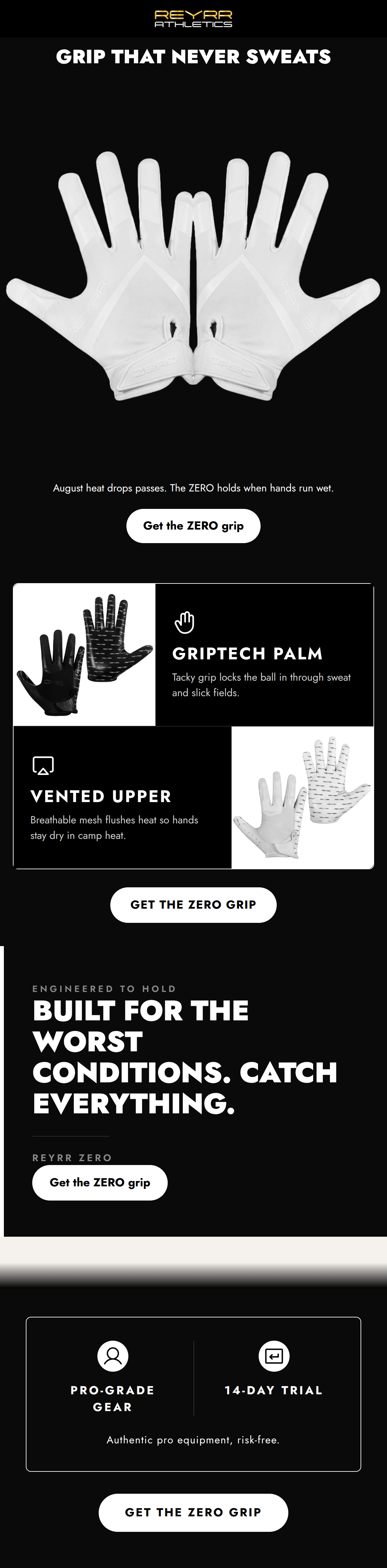
Preview text: August heat. Sweaty hands. The ZERO grip holds when the game gets ugly.
GRIP THAT NEVER SWEATS
August heat drops passes. The ZERO holds when hands run wet.
→ Get the ZERO grip
Why This Email Works
This is a highly effective, punchy promotional email that deeply understands its target audience. It immediately addresses a specific pain point (sweaty hands dropping passes in August heat) with a clear, authoritative solution. The copy is tight, aggressive, and perfectly aligned with the 'premium tactical' brand voice. The primary visual flaw is a jarring color transition near the footer that breaks the dark, moody aesthetic. Fix the visual inconsistencies, and this is a top-tier conversion asset.
Hero (top/initial part) Impact
85/100- Extremely punchy, outcome-focused headline ('GRIP THAT NEVER SWEATS').
- High-contrast product image immediately establishes what is being sold.
- Sub-copy perfectly sets up the problem/solution dynamic.
Content Structure & Flow
85/100- Logical progression from problem awareness to technical features to risk reversal.
- Consistent rhythm of text, imagery, and CTAs.
Visual Hierarchy & Layout
70/100- Excellent use of stark black and white to make the content pop.
- The alternating layout in the feature cards breaks up vertical monotony.
- Headlines clearly dominate supporting text.
Call-to-Action Strength
90/100- Excellent repetition of a single, focused conversion goal.
- Action-oriented CTA copy rather than a generic 'Shop Now'.
- High visual contrast ensures buttons pass the 'squint test'.
Message Clarity & Tone
95/100- Nails the aggressive, no-excuses brand persona.
- Translates technical features (vented upper) directly into on-field benefits (hands stay dry).
- No fluff or marketing jargon.
Readability & Scannability
82/100- Bite-sized copy blocks prevent cognitive overload.
- Iconography in the feature cards aids quick visual scanning.
- Large, legible typography for primary messages.
Offer & Value Proposition
85/100- Directly addresses a major pain point (slipping grip).
- Strong trust signals in the footer (Pro-Grade Gear, 14-Day Trial).
Personalization & Audience Fit
90/100- Highly specific references to the sport's environment.
- Validates the athlete's intensity and need for specialized gear.
Copy Conciseness & Word Economy
95/100- Zero filler phrasing.
- High impact-to-word ratio.
- Reads like a directive from a coach, fitting the brand perfectly.
Quick Wins
- Unify the casing on all CTA buttons to ALL CAPS ('GET THE ZERO GRIP') for consistency and brand alignment.
- Remove the jarring light-beige/grey (`#f5f2ed`) background blocks above the footer to maintain the immersive dark aesthetic.
- Brighten the dark grey `#8a8a8a` text in the pull-quote section to improve contrast and readability.


Create Professional Email Designs
Generate beautiful, on-brand email designs in seconds. Just enter your brand URL and let AI do the rest.