Automotive Promotional Email Template
“Design that breaks boundaries.”

Design Score
62/100This email is a visual masterpiece but a strategic hallucination. While the dark-mode aesthetic and layout perfectly match Rivian's premium brand, the copy commits a fatal error: it discusses 'CSS', 'Glassmorphism', and 'Web-design' techniques instead of the vehicle itself. It reads like an internal design team showcase rather than a customer-facing marketing asset, likely confusing the average buyer who wants to know about the truck's capabilities, not the HTML code used to sell it.
Create Your Own
Generate professional email designs like this one in seconds with Kopi AI.
Email Details
- Subject Line
- Design that breaks boundaries.
- Brand
- Rivian
- Industry
- Automotive
- Email Type
- Promotional
- Created
- February 7, 2026
Brand Colors
Email Copy
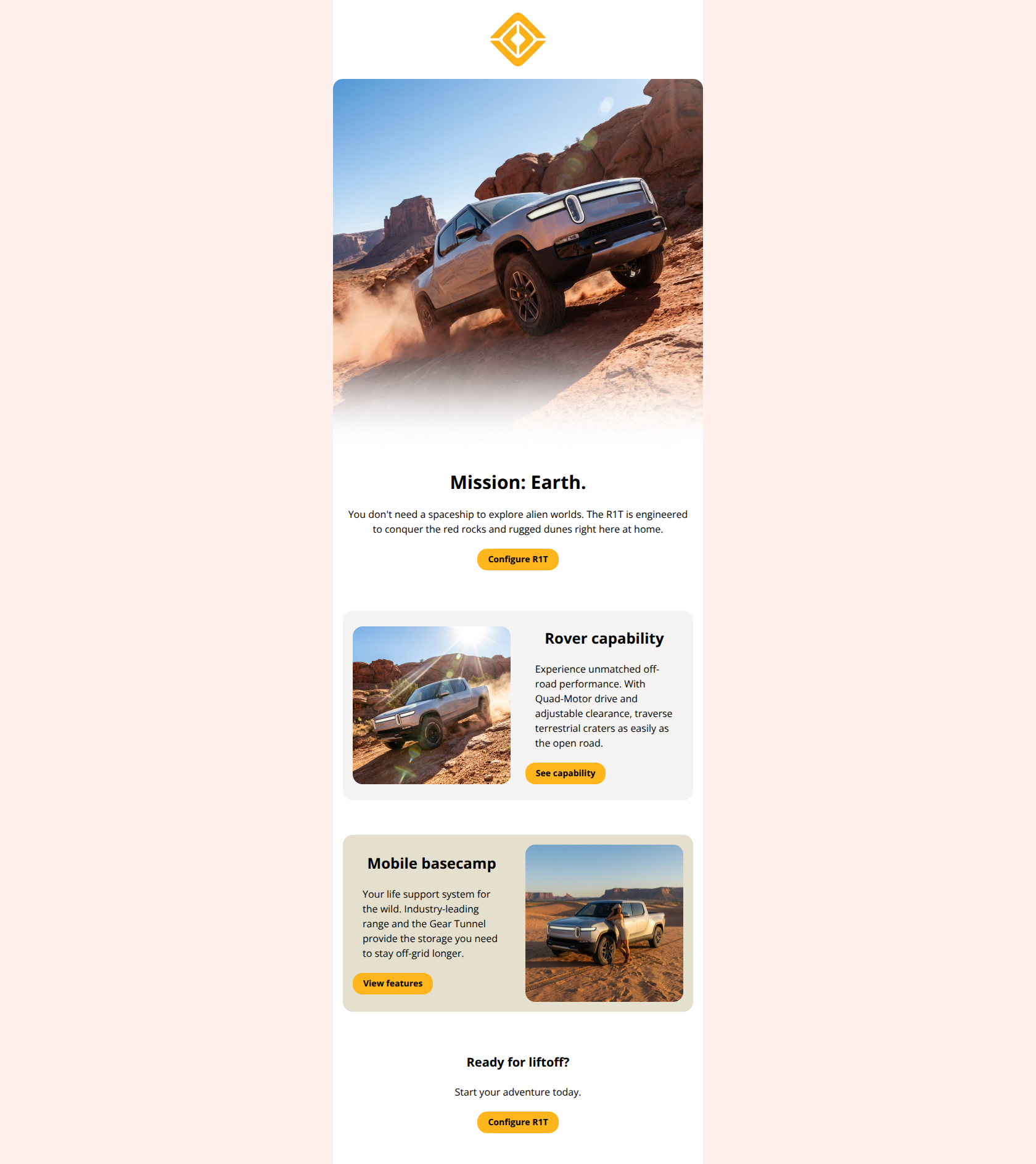
Clarity in the Chaos.
A design language built for the wild, where technology meets the elements.
→ Configure Yours
The Unbounded Canvas
Standard email design confines us to solid fills and rigid grids. Modern CSS allows the environment—the very texture of the wild—to become the ink. This exploration bridges the gap between static constraints and the immersive reality of the R1T.
Pattern 01
Materiality Spotlight
Breaking the Grid
True depth requires overlap. By escaping the table structure, we can layer content to reflect the physical utility of the Gear Tunnel—storage that exists between the lines.
Pattern 02
Structural Overlap
Reactive Surfaces
The connection between driver and machine creates a new layer of reality. Glassmorphism and blur effects simulate this interface, softening the digital edge against the organic world.
Pattern 03
Glassmorphism UI
Experience the art of the R1T.
See the design language in motion on our full site.
→ Configure Yours
Why This Email Works
This email is a visual masterpiece but a strategic hallucination. While the dark-mode aesthetic and layout perfectly match Rivian's premium brand, the copy commits a fatal error: it discusses 'CSS', 'Glassmorphism', and 'Web-design' techniques instead of the vehicle itself. It reads like an internal design team showcase rather than a customer-facing marketing asset, likely confusing the average buyer who wants to know about the truck's capabilities, not the HTML code used to sell it.
Hero Impact
85/100- High-quality hero imagery that perfectly captures the brand mood.
- Clear, high-contrast primary CTA ('Configure Yours') immediately visible without scrolling.
Content Structure & Flow
65/100- The zigzag layout (alternating text and images) keeps the eye moving down the page effectively.
- Section breaks are clean, using spacing and background color shifts to define distinct areas.
Visual Hierarchy & Layout
90/100- Premium dark-mode execution that aligns perfectly with the 'adventure/tech' aesthetic.
- Text and images are balanced beautifully, preventing any section from feeling cluttered.
Call-to-Action Strength
75/100- Primary CTA color (#FFB51B) offers perfect contrast against the dark background.
- Button labels ('Configure Yours') are action-oriented and specific.
Message Clarity & Tone
30/100- The headline 'Clarity in the Chaos' is on-brand and evocative.
- The tone is confident and sophisticated, even if the subject matter is wrong.
Readability & Scannability
60/100- Typography is crisp, modern, and highly legible against the dark background.
- Short paragraphs prevent 'walls of text'.
Offer & Value Proposition
40/100- The aspirational value of 'adventure' is visually implied, even if the text misses the mark.
Personalization & Audience Fit
20/100- None observed in the copy content.
Quick Wins
- **Rewrite Headers:** Change 'Pattern 01', 'Pattern 02', and 'Pattern 03' to benefit-focused titles like 'Elemental Design', 'Hidden Storage', and 'Intuitive Interface'.
- **Fix Body Copy:** Replace all references to 'CSS', 'HTML', and 'Email Design' with copy describing the *vehicle's* materials, storage capacity, and screen technology.
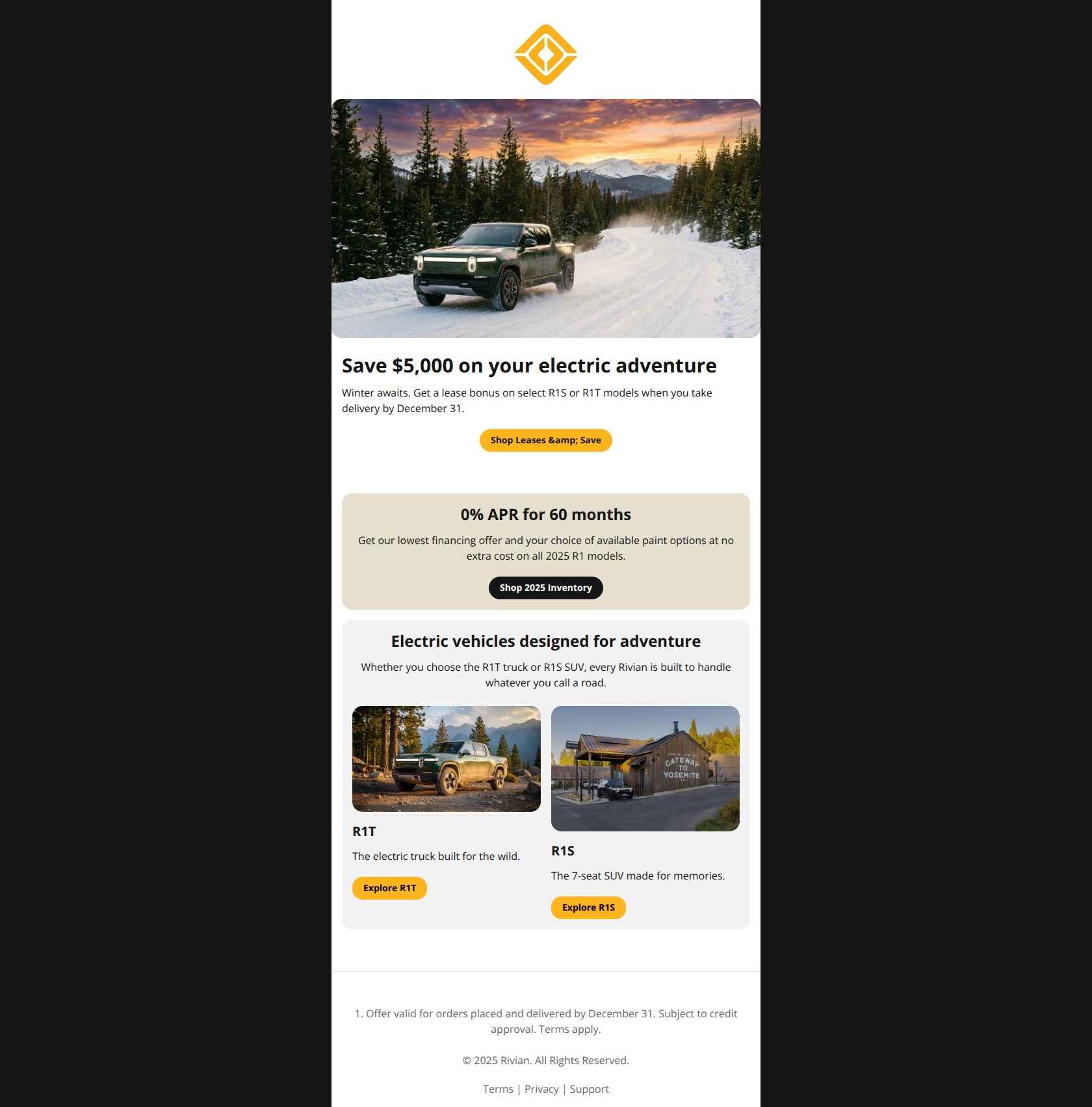
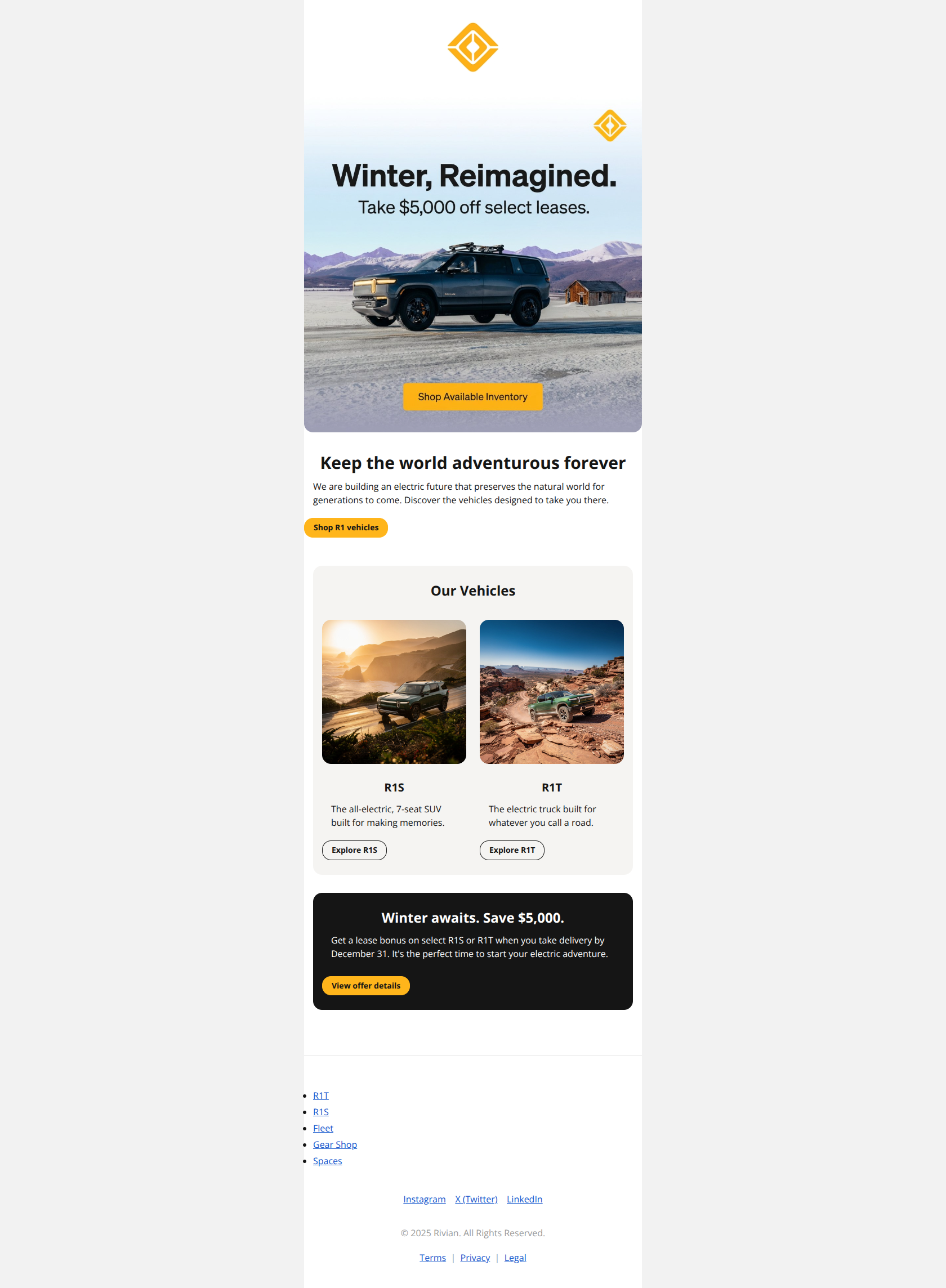
- **Leverage the Context:** Add a banner or sub-text near the top CTA mentioning the '$5,000 Lease Bonus' to give a tangible reason to click now.
- **Update Alt Text:** Ensure image alt text describes the truck/landscape for accessibility, rather than describing the 'masking technique' used in the design.
Create Professional Email Designs
Generate beautiful, on-brand email designs in seconds. Just enter your brand URL and let AI do the rest.