Food & Beverage Promotional Email Template
“Dark Mode: Activated 🌑”
Design Score
85/100This is a visually striking, on-brand email that executes the 'Neon/Dark Mode' theme with high fidelity. While the storytelling and visual hierarchy are excellent, the email leaves conversion opportunities on the table by omitting pricing and using weak secondary CTAs in the merch section.
Create Your Own
Generate professional email designs like this one in seconds with Kopi AI.
Email Details
- Subject Line
- Dark Mode: Activated 🌑
- Brand
- JOYRIDE
- Industry
- Food & Beverage
- Email Type
- Promotional
- Created
- January 10, 2026
Brand Colors
Email Copy
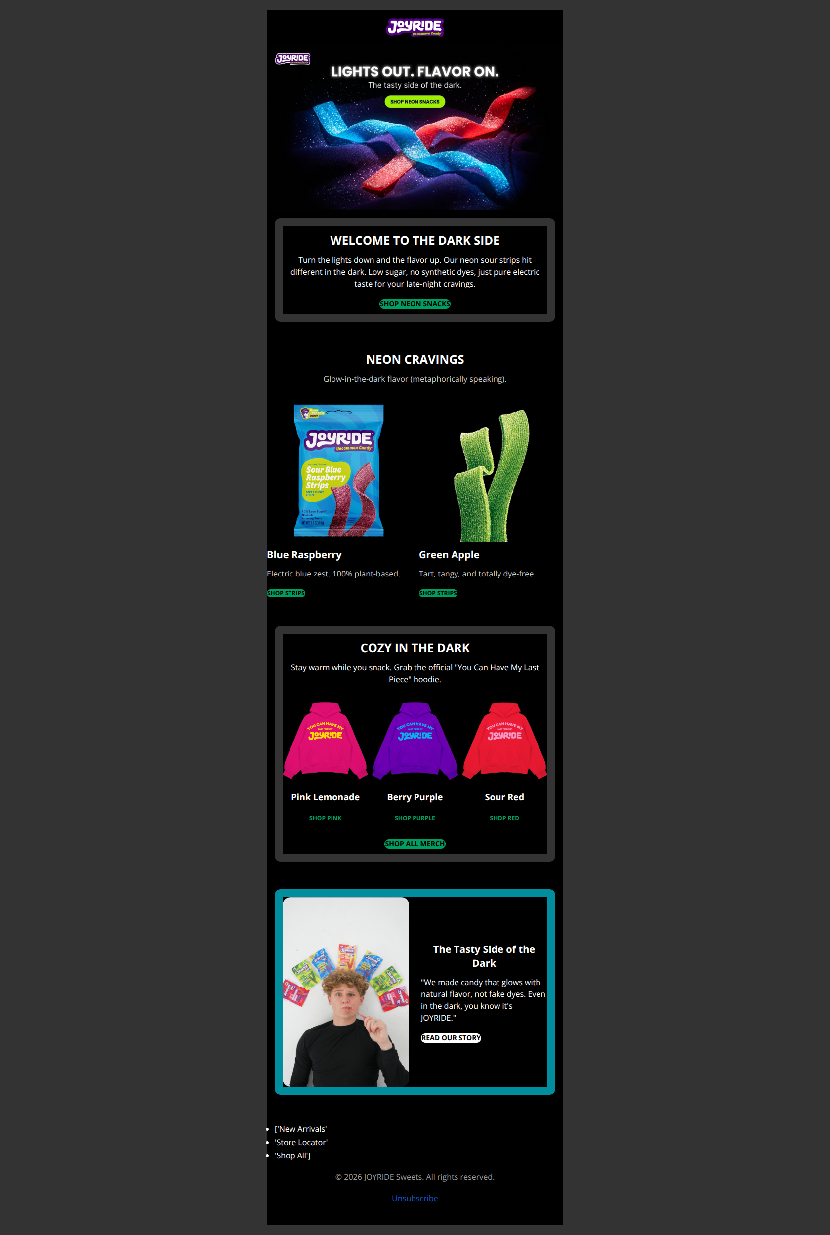
WELCOME TO THE DARK SIDE
Turn the lights down and the flavor up. Our neon sour strips hit different in the dark. Low sugar, no synthetic dyes, just pure electric taste for your late-night cravings.
→ SHOP NEON SNACKS
NEON CRAVINGS
Glow-in-the-dark flavor (metaphorically speaking).
Blue Raspberry
Electric blue zest. 100% plant-based.
→ SHOP STRIPS
Green Apple
Tart, tangy, and totally dye-free.
→ SHOP STRIPS
COZY IN THE DARK
Stay warm while you snack. Grab the official "You Can Have My Last Piece" hoodie.
Pink Lemonade
→ SHOP PINK
Berry Purple
→ SHOP PURPLE
Sour Red
→ SHOP RED
→ SHOP ALL MERCH
The Tasty Side of the Dark
"We made candy that glows with natural flavor, not fake dyes. Even in the dark, you know it's JOYRIDE."
→ READ OUR STORY
- ['New Arrivals'
- 'Store Locator'
- 'Shop All']
© 2026 JOYRIDE Sweets. All rights reserved.
Unsubscribe
Why This Email Works
This is a visually striking, on-brand email that executes the 'Neon/Dark Mode' theme with high fidelity. While the storytelling and visual hierarchy are excellent, the email leaves conversion opportunities on the table by omitting pricing and using weak secondary CTAs in the merch section.
Hero Impact
90/100- High-contrast visuals that perfectly match the 'Neon' campaign theme.
- Primary CTA button (#009E60) pops aggressively against the black background.
Content Structure & Flow
85/100- Excellent use of alternating background colors (#000000 vs #333333) to visually separate logical sections.
- Seamless transition from candy products to relevant merchandise.
Visual Hierarchy & Layout
85/100- Strong distinction between headings, body copy, and buttons.
- Uncluttered use of negative space around the product shots.
Call-to-Action Strength
80/100- Main CTA 'SHOP NEON SNACKS' uses benefit-driven, thematic copy.
- High contrast green-on-black color choice for primary actions.
Message Clarity & Tone
95/100- Phrases like 'Glow-in-the-dark flavor (metaphorically speaking)' add personality while managing expectations.
- Consistently playful voice that feels authentic to the Ryan Trahan brand.
Readability & Scannability
90/100- Short, punchy paragraphs preventing any wall-of-text fatigue.
- High contrast text (#FFFFFF and #CCCCCC) on dark backgrounds ensures accessibility.
Offer & Value Proposition
75/100- Clear articulation of the 'better-for-you' benefits (Low sugar, no synthetic dyes).
Personalization & Audience Fit
70/100- The content is hyper-relevant to the brand's cult following.
Quick Wins
- Add price points (e.g., '$X.XX') under the product titles in the grid to set commercial expectations.
- Underline the 'SHOP PINK', 'SHOP PURPLE' text links in the merch section to improve click affordance.
- Add 'alt' text to the hero image that explicitly duplicates the headline 'LIGHTS OUT. FLAVOR ON.' for accessibility.
- Change the final CTA in the founder section from 'Read Our Story' to 'Shop the Collection' (or add a Shop button next to it).


Create Professional Email Designs
Generate beautiful, on-brand email designs in seconds. Just enter your brand URL and let AI do the rest.