Kids & Baby Welcome Email Template
“Bun venit! Copilul tău devine o capodoperă”
Design Score
87/100This is an exceptionally strong welcome email that successfully brings the premium Selfarama value proposition to life. The visual flow naturally guides the reader from a highly communicative hero image down through a logical, reassuring narrative: what the product is, how it works, who else loves it, and an urgent reason to buy. The brand voice is perfectly executed, leaning into emotional resonance and heirloom quality. To push this into the 90+ range, the email needs targeted improvements in readability (specifically formatting dense text blocks), diversifying the monotonous CTA copy, and standardizing text alignment to create a smoother scanning experience.
Create Your Own
Generate professional email designs like this one in seconds with Kopi AI.
Email Details
- Subject Line
- Bun venit! Copilul tău devine o capodoperă
- Brand
- Selfarama
- Industry
- Kids & Baby
- Email Type
- Welcome
- Created
- March 21, 2026
Brand Colors
Email Copy
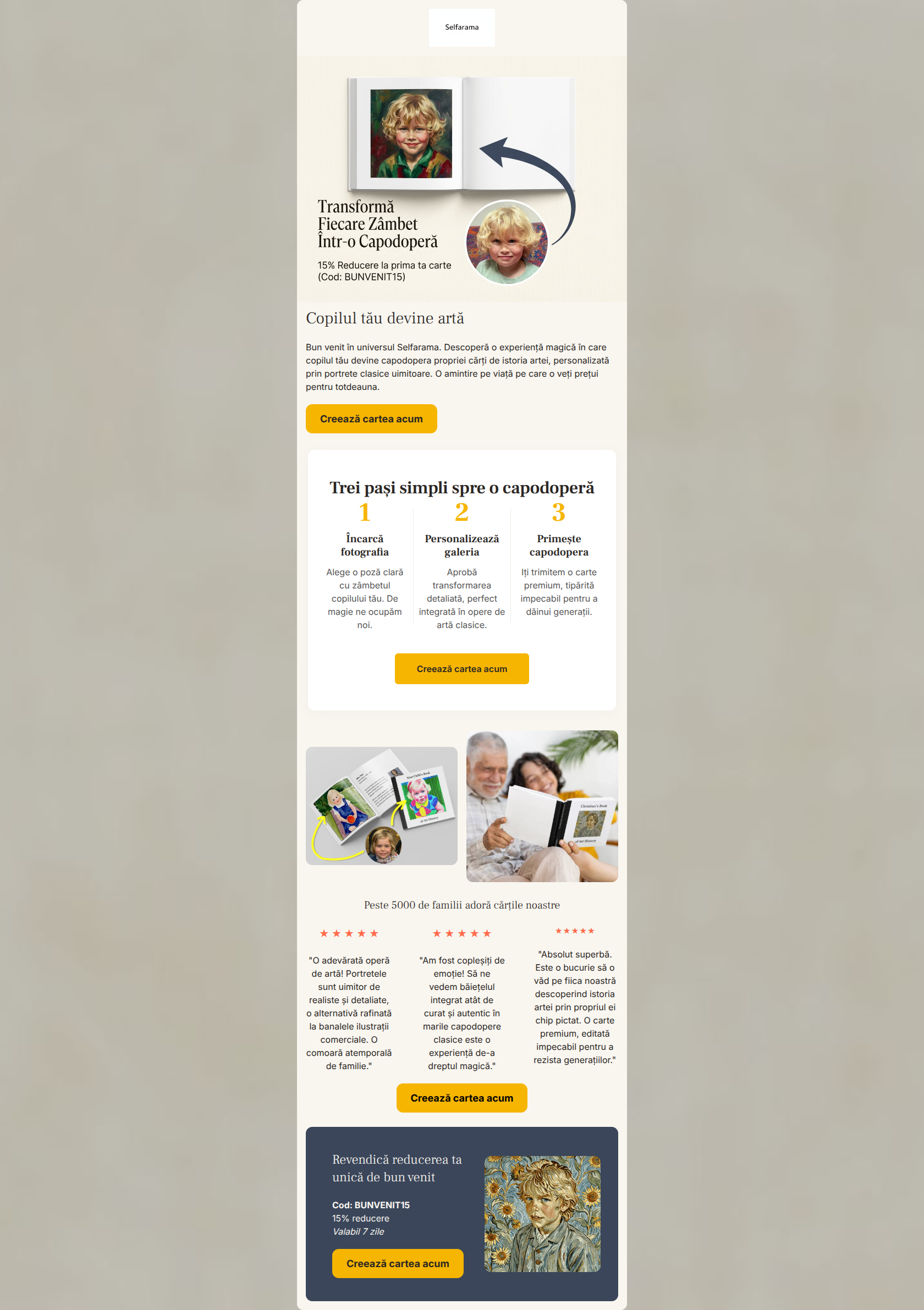
Copilul tău devine artă
Bun venit în universul Selfarama, părinte drag! Descoperă o experiență magică în care copilul tău devine capodopera propriei cărți de istoria artei, personalizată prin portrete clasice uimitoare. O amintire pe viață pe care o veți prețui pentru totdeauna.
→ Creează cartea acum
Peste 5000 de familii adoră cărțile noastre
★ ★ ★ ★ ★
"O adevărată operă de artă! Portretele sunt uimitor de realiste și detaliate, o alternativă rafinată la banalele ilustrații comerciale. O comoară atemporală de familie."
★ ★ ★ ★ ★
"Am fost copleșiți de emoție! Să ne vedem băiețelul integrat atât de curat și autentic în marile capodopere clasice este o experiență de-a dreptul magică."
★ ★ ★ ★ ★
"Absolut superbă. Este o bucurie să o văd pe fiica noastră descoperind istoria artei prin propriul ei chip pictat. O carte premium, editată impecabil pentru a rezista generațiilor."
→ Creează cartea acum
Părinte drag, revendică reducerea ta unică de bun venit
Cod: BUNVENIT15 15% reducere Valabil 7 zile
→ Creează cartea acum
Why This Email Works
This is an exceptionally strong welcome email that successfully brings the premium Selfarama value proposition to life. The visual flow naturally guides the reader from a highly communicative hero image down through a logical, reassuring narrative: what the product is, how it works, who else loves it, and an urgent reason to buy. The brand voice is perfectly executed, leaning into emotional resonance and heirloom quality. To push this into the 90+ range, the email needs targeted improvements in readability (specifically formatting dense text blocks), diversifying the monotonous CTA copy, and standardizing text alignment to create a smoother scanning experience.
Hero Impact
88/100- Immediate visual demonstration of the core product value.
- Strong, emotion-driven headline that focuses on the outcome.
- High-contrast CTA button positioned high in the email.
Content Structure & Flow
92/100- Perfect sequencing of information for a high-consideration, premium product.
- The 3-step explainer breaks down potential friction regarding the personalization process.
- Strategic placement of the discount code at the bottom anchors the email and rewards scrolling.
Visual Hierarchy & Layout
85/100- Excellent use of the dark canvas background to frame the email and anchor the final offer.
- The lifestyle image grid effectively balances product shots with human connection.
- Clean, premium aesthetic that fully supports the 'boutique publisher' positioning.
Call-to-Action Strength
80/100- Flawless color contrast for all CTA buttons.
- Ample white space around buttons makes them easy to identify as clickable targets.
- Frequent placement ensures a conversion opportunity is always within view.
Message Clarity & Tone
90/100- Evocative, benefit-driven language that focuses on the emotional outcome.
- Clear, jargon-free explanation of how the custom portrait process works.
- Review selection specifically reinforces the 'non-commercial/non-cartoonish' differentiator.
Readability & Scannability
78/100- Excellent use of large numbers in the '3 steps' section to guide the eye.
- Strong headline hierarchy (H1 -> H2) clearly demarcates sections.
- High contrast between the dark charcoal text and the cream/white backgrounds.
Offer & Value Proposition
90/100- The before/after image is the ultimate 'show, don't tell' value proposition.
- Clear framing of the discount code, percentage, and expiration in a dedicated highlight box.
- The offer is framed as a 'welcome' gift, which builds brand affinity.
Personalization & Audience Fit
92/100- Imagery perfectly reflects the target audience's desired lifestyle and emotional outcomes.
- The 'Clean Editorial' visual style signals premium quality, justifying a higher price point.
- Testimonials are curated to address specific audience pain points (e.g., 'alternative to banal commercial illustrations').
Quick Wins
- Apply bold text to the best 3-4 words in each testimonial to improve scannability.
- Update the CTA button copy so it changes as the user scrolls (e.g., 'Creeaza cartea', 'Incepe personalizarea', 'Foloseste codul').
- Center-align the heading and body copy in the hero section to match the alignment of the rest of the email.




Create Professional Email Designs
Generate beautiful, on-brand email designs in seconds. Just enter your brand URL and let AI do the rest.