Food & Beverage Product Launch Email Template
“bold colors. zero junk.”
Design Score
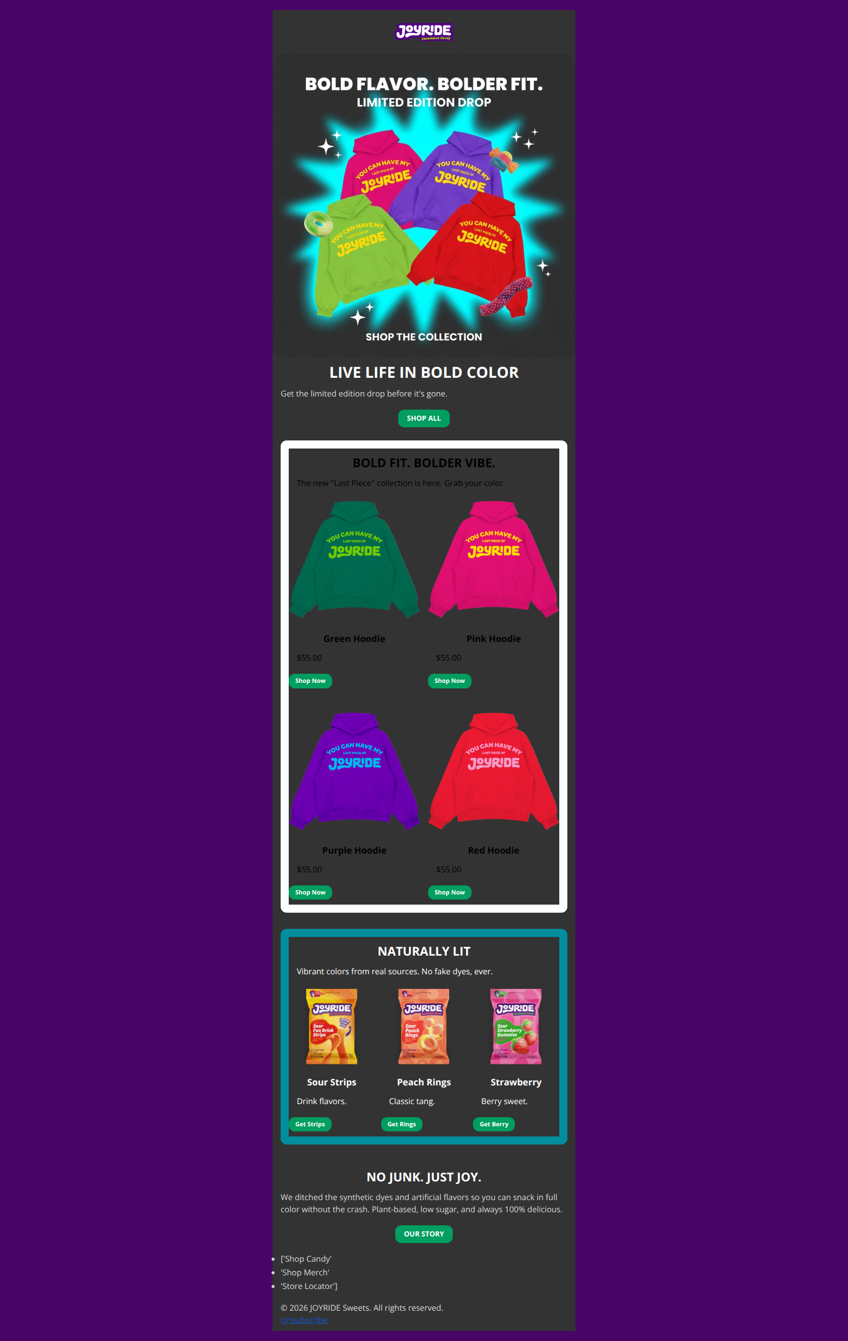
50/100This email effectively hypes a limited edition drop with a vibrant hero and clear layout, but it suffers from a catastrophic critical failure in the primary product grid. The text in the 'Merch' section renders as black on a dark grey background, making product names and prices effectively invisible. This single contrast error invalidates the stronger elements of the design.
Create Your Own
Generate professional email designs like this one in seconds with Kopi AI.
Email Details
- Subject Line
- bold colors. zero junk.
- Brand
- JOYRIDE
- Industry
- Food & Beverage
- Email Type
- Product Launch
- Created
- January 11, 2026
Brand Colors
Email Copy
LIVE LIFE IN BOLD COLOR
Get the limited edition drop before it's gone.
→ SHOP ALL
BOLD FIT. BOLDER VIBE.
The new "Last Piece" collection is here. Grab your color.
Green Hoodie
$55.00
→ Shop Now
Pink Hoodie
$55.00
→ Shop Now
Purple Hoodie
$55.00
→ Shop Now
Red Hoodie
$55.00
→ Shop Now
NATURALLY LIT
Vibrant colors from real sources. No fake dyes, ever.
Sour Strips
Drink flavors.
→ Get Strips
Peach Rings
Classic tang.
→ Get Rings
Strawberry
Berry sweet.
→ Get Berry
NO JUNK. JUST JOY.
We ditched the synthetic dyes and artificial flavors so you can snack in full color without the crash. Plant-based, low sugar, and always 100% delicious.
→ OUR STORY
- ['Shop Candy'
- 'Shop Merch'
- 'Store Locator']
© 2026 JOYRIDE Sweets. All rights reserved. Unsubscribe
Why This Email Works
This email effectively hypes a limited edition drop with a vibrant hero and clear layout, but it suffers from a catastrophic critical failure in the primary product grid. The text in the 'Merch' section renders as black on a dark grey background, making product names and prices effectively invisible. This single contrast error invalidates the stronger elements of the design.
Hero Impact
85/100- High-energy visual that clearly displays the product variety.
- Headline 'LIVE LIFE IN BOLD COLOR' perfectly aligns with the product aesthetics.
Content Structure & Flow
80/100- Clear delineation between the 'Merch' section and the 'Candy' section.
- Logical progression from 'What's New' to 'What's Always Good'.
Visual Hierarchy & Layout
40/100- Distinct section backgrounds help separate the 'Merch' story from the 'Candy' story.
- 2x2 grid layout is clean and mobile-friendly.
Call-to-Action Strength
85/100- Primary Green (#009E60) buttons pop effectively against the dark backgrounds.
- Playful, product-specific copy in the second grid ('Get Berry', 'Get Rings').
Message Clarity & Tone
75/100- The tagline 'Naturally Lit' is clever and memorable.
- Short, punchy sentences respect the reader's time.
Readability & Scannability
20/100- Paragraphs are kept very short.
- Bullet-proof button styling ensures CTAs remain readable even if images fail.
Offer & Value Proposition
75/100- Price transparency ($55.00) is good; no hiding the cost until checkout.
- Clear 'Limited Edition' messaging creates natural urgency.
Personalization & Audience Fit
20/100- The content aligns well with the 'creator-led' / Gen-Z audience vibe.
Quick Wins
- CRITICAL FIX: Change the font color of the Merch Grid headlines and prices to White (#FFFFFF). Currently, they are black-on-dark-grey and invisible.
- Change 'Shop Now' buttons in the merch grid to specific variants like 'Get Pink' or 'Get Green' to match the fun tone of the candy section.
- Add a 'Free Shipping' callout near the $55 price point if applicable, as this often tips the scale for merch purchases.
- Bold the 'Low sugar' and 'Plant-based' text in the footer paragraph to make these key differentiators skimmable.


Create Professional Email Designs
Generate beautiful, on-brand email designs in seconds. Just enter your brand URL and let AI do the rest.