Design Score
88/100This is a highly effective, frictionless account activation email. It expertly balances the transactional necessity of a 'Confirm Email' action with marketing reinforcement, reminding the user exactly why they signed up. The structure is clean, the word economy is fantastic, and the dual primary CTAs follow best practices perfectly. The main missed opportunity lies in the feature grid, where the copy is slightly too brief to communicate MiPerrito's core competitive advantages—specifically the lack of GPS subscription fees.
Create Your Own
Generate professional email designs like this one in seconds with Kopi AI.
Email Details
- Subject Line
- ¡Bienvenido a MiPerrito!
- Brand
- MiPerrito
- Industry
- Pets
- Email Type
- Welcome
- Created
- May 17, 2026
Brand Colors
Email Copy
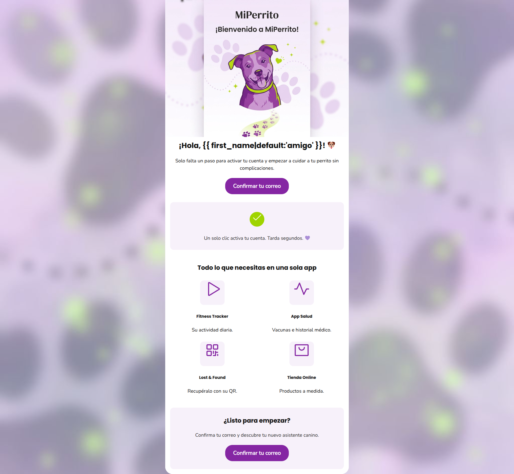
¡Hola, amigo! 🐶
Solo falta un paso para activar tu cuenta y empezar a cuidar a tu perrito sin complicaciones.
→ Confirmar tu correo
Un solo clic activa tu cuenta. Tarda segundos. 💜
Todo lo que necesitas en una sola app
Fitness Tracker
Su actividad diaria.
App Salud
Vacunas e historial médico.
Lost & Found
Recupéralo con su QR.
Tienda Online
Productos a medida.
¿Listo para empezar?
Confirma tu correo y descubre tu nuevo asistente canino.
→ Confirmar tu correo
Why This Email Works
This is a highly effective, frictionless account activation email. It expertly balances the transactional necessity of a 'Confirm Email' action with marketing reinforcement, reminding the user exactly why they signed up. The structure is clean, the word economy is fantastic, and the dual primary CTAs follow best practices perfectly. The main missed opportunity lies in the feature grid, where the copy is slightly too brief to communicate MiPerrito's core competitive advantages—specifically the lack of GPS subscription fees.
Hero Impact
85/100- Immediate clarity on the email's purpose.
- Personalized greeting using dynamic tags.
- On-brand, engaging, and friendly hero illustration.
Content Structure & Flow
90/100- Excellent use of the reassurance block directly after the hero CTA.
- Perfect framing of the user journey from 'need to activate' to 'ready to start'.
- The bottom CTA acts as a perfect safety net for users who scroll past the hero.
Visual Hierarchy & Layout
85/100- Clear module separation using subtle brand background colors.
- The 2x2 grid breaks up vertical scrolling and presents features in an easily digestible format.
- Great use of a highly visible, contrasting green checkmark to draw the eye to the reassurance text.
Call-to-Action Strength
98/100- Zero ambiguity: both buttons drive toward the exact same primary goal.
- Excellent color contrast against the #FFFFFF and #F7F1FA backgrounds.
- Action-oriented, clear button copy.
Message Clarity & Tone
88/100- Microcopy 'Un solo clic activa tu cuenta. Tarda segundos.' directly addresses user friction and time anxiety.
- Tone strikes the right balance between a tech utility and a caring pet brand.
Readability & Scannability
92/100- Bite-sized text blocks.
- High contrast between text (#111111, #2F2F2F) and backgrounds.
- No dense paragraphs or 'walls of text'.
Offer & Value Proposition
75/100- Successfully transforms a boring 'confirm email' step into a reminder of the product's value.
- Hits all 4 core pillars of the app.
Personalization & Audience Fit
80/100- Safe and friendly fallback for the first name tag.
- Aesthetic alignment with modern tech users.
Copy Conciseness & Word Economy
95/100- Zero fluff or filler words.
- Direct, action-driven syntax.
- Information is communicated in the fewest words possible.
Quick Wins
- Update the 'Lost & Found' feature text to highlight 'Sin cuotas mensuales' (No monthly fees) to reinforce your primary market differentiator.
- Add a brief transitional phrase like 'Esto es lo que te espera adentro:' directly above the 2x2 feature grid.




Create Professional Email Designs
Generate beautiful, on-brand email designs in seconds. Just enter your brand URL and let AI do the rest.