Health & Wellness Product Launch Email Template
“Before everyone else: A new era”
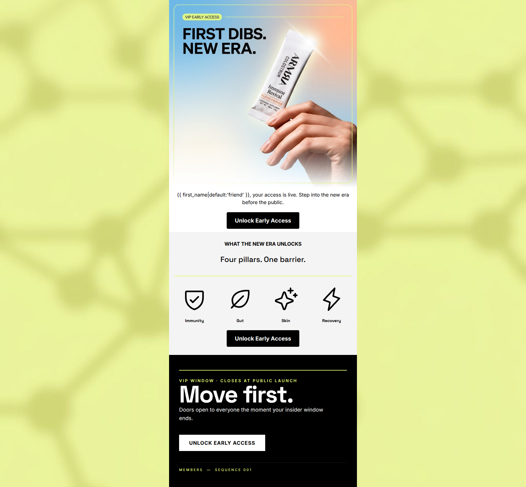
Design Score
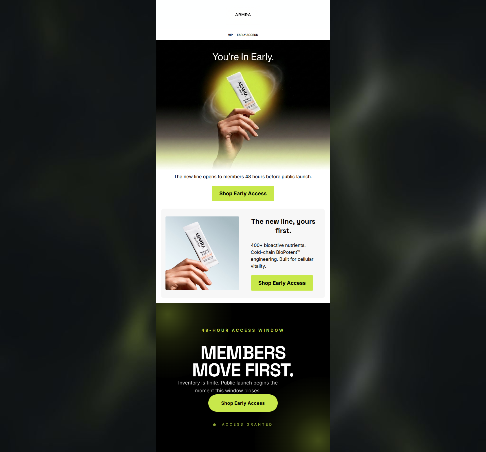
83/100This is a strong, highly stylized product launch email that leverages exclusivity and intrigue to drive clicks. The visual execution is premium, aligning perfectly with ARMRA's brand identity, and the use of urgency in the final block is compelling. However, the copy leans heavily on mystery ('New Era') without explicitly mentioning the actual product (Blood Orange flavor) shown in the image, which may cause hesitation for some users. The email strictly adheres to best practices for CTA repetition, creating a clear, singular path to conversion.
Create Your Own
Generate professional email designs like this one in seconds with Kopi AI.
Email Details
- Subject Line
- Before everyone else: A new era
- Brand
- ARMRA [eval-prod 2026-04-25]
- Industry
- Health & Wellness
- Email Type
- Product Launch
- Created
- April 25, 2026
Brand Colors
Email Copy
friend, your access is live. Step into the new era before the public.
→ Unlock Early Access
WHAT THE NEW ERA UNLOCKS
Four pillars. One barrier.
Immunity
Gut
Skin
Recovery
→ Unlock Early Access
Why This Email Works
This is a strong, highly stylized product launch email that leverages exclusivity and intrigue to drive clicks. The visual execution is premium, aligning perfectly with ARMRA's brand identity, and the use of urgency in the final block is compelling. However, the copy leans heavily on mystery ('New Era') without explicitly mentioning the actual product (Blood Orange flavor) shown in the image, which may cause hesitation for some users. The email strictly adheres to best practices for CTA repetition, creating a clear, singular path to conversion.
Hero Impact
85/100- Striking visual contrast that highlights the product.
- Strong, action-oriented headline ('FIRST DIBS').
- Immediate introduction of the primary CTA.
Content Structure & Flow
80/100- Clear progression of thought from top to bottom.
- Excellent pacing with distinct, easy-to-digest sections.
Visual Hierarchy & Layout
88/100- Excellent use of negative space to prevent clutter.
- The final black block provides exceptional contrast and draws the eye directly to the final CTA.
- Icons effectively break up the layout and provide visual resting points.
Call-to-Action Strength
100/100- Perfect consistency in CTA phrasing and destination.
- High contrast buttons that stand out clearly against their respective backgrounds.
- Strategic placement at the top, middle, and bottom of the user's scroll path.
Message Clarity & Tone
75/100- Nails the brand's authoritative, 'velvet-rope' voice.
- Creates a strong sense of FOMO ('Doors open to everyone the moment your insider window ends').
Readability & Scannability
90/100- Minimal text overhead; no dense paragraphs.
- Strong use of bolding and headers to create a scan path.
Offer & Value Proposition
75/100- Early access is a proven conversion driver for loyal audiences.
- Core benefits (Immunity, Gut, Skin, Recovery) align perfectly with the target psychographic.
Personalization & Audience Fit
80/100- The 'insider' framing perfectly targets early adopters in the health space.
Copy Conciseness & Word Economy
95/100- Zero throat-clearing or filler words.
- High-impact verbs drive action.
Quick Wins
- Increase the font size or weight of the labels (Immunity, Gut, Skin, Recovery) under the four icons for better legibility.
- Add a single, short sentence under 'Four pillars. One barrier.' that explicitly connects the new Blood Orange product to these foundational benefits.
Create Professional Email Designs
Generate beautiful, on-brand email designs in seconds. Just enter your brand URL and let AI do the rest.