Kids & Baby Promotional Email Template
“Beat the mess! Grab 20% off our zip-leg bibs”
Design Score
73/100This email effectively uses playful imagery and clear, benefit-driven copy to communicate a solid promotional offer, creating an immediate visual impact. However, the redundant CTA phrasing and lack of an overarching narrative beyond 'buy now' limit its full conversion potential.
Create Your Own
Generate professional email designs like this one in seconds with Kopi AI.
Email Details
- Subject Line
- Beat the mess! Grab 20% off our zip-leg bibs
- Brand
- Zippy Baby World
- Industry
- Kids & Baby
- Email Type
- Promotional
- Created
- March 2, 2026
Brand Colors
Email Copy
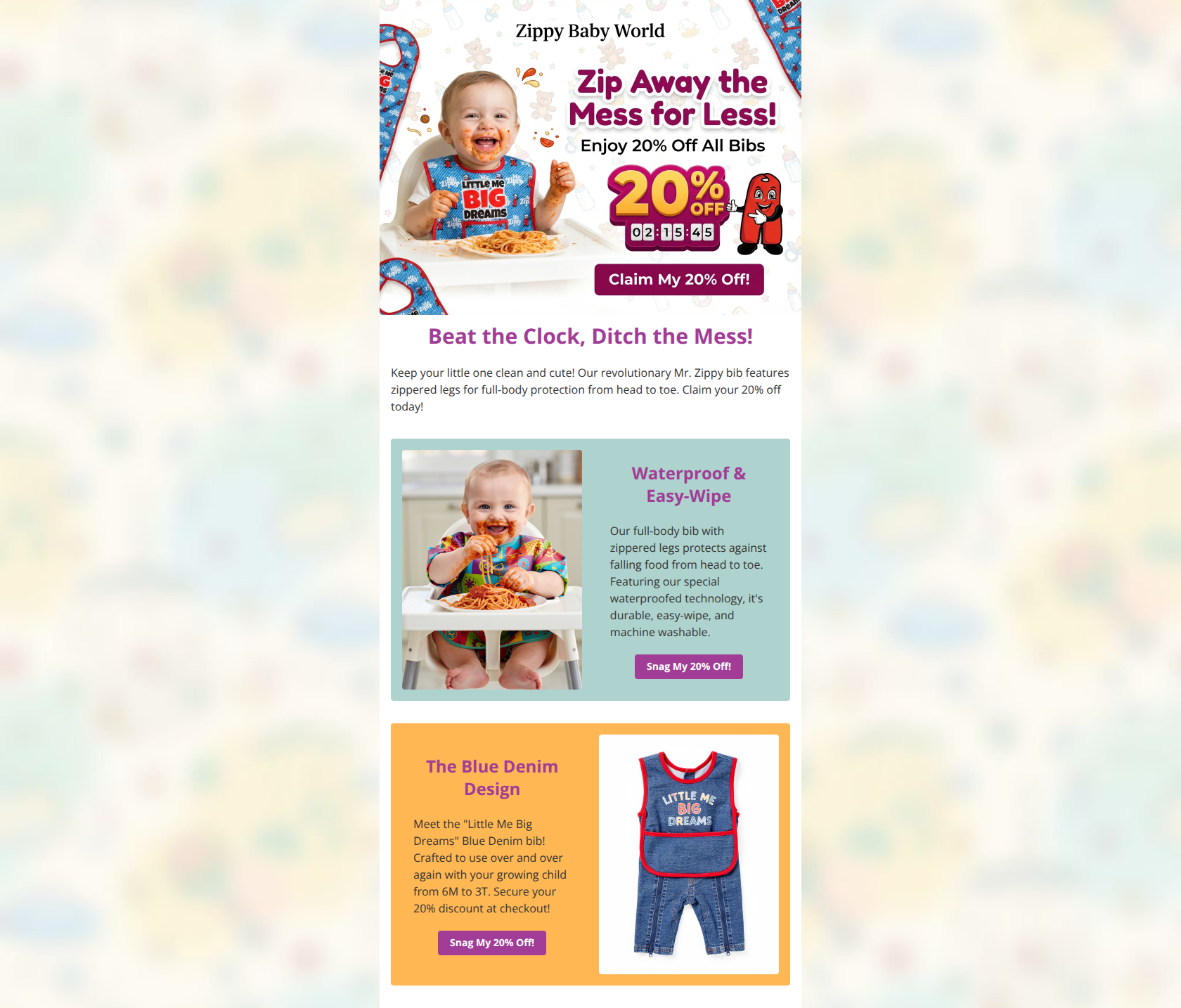
Beat the Clock, Ditch the Mess!
Keep your little one clean and cute! Our revolutionary Mr. Zippy bib features zippered legs for full-body protection from head to toe. Claim your 20% off today!
Waterproof & Easy-Wipe
Our full-body bib with zippered legs protects against falling food from head to toe. Featuring our special waterproofed technology, it's durable, easy-wipe, and machine washable.
→ Snag My 20% Off!
The Blue Denim Design
Meet the "Little Me Big Dreams" Blue Denim bib! Crafted to use over and over again with your growing child from 6M to 3T. Secure your 20% discount at checkout!
→ Snag My 20% Off!
Why This Email Works
This email effectively uses playful imagery and clear, benefit-driven copy to communicate a solid promotional offer, creating an immediate visual impact. However, the redundant CTA phrasing and lack of an overarching narrative beyond 'buy now' limit its full conversion potential.
Hero Impact
85/100- Strong, relatable imagery that instantly communicates the product's value proposition.
- Clear statement of the 20% off offer directly in the hero visual.
Content Structure & Flow
75/100- The alternating layout (image left, then image right) creates a rhythm that keeps the eye moving.
- Sections are clearly divided by color blocks, making it easy to parse.
Visual Hierarchy & Layout
80/100- Good use of whitespace within the cards to prevent them from feeling cluttered.
- Product imagery is large and clear, effectively showcasing the unique features (like the legs).
Call-to-Action Strength
60/100- CTAs are styled as clear, clickable buttons that stand out from the text.
- The buttons use the primary brand color, maintaining visual consistency.
Message Clarity & Tone
82/100- Benefit-driven language ('full-body protection', 'easy-wipe') clearly communicates value.
- The problem/solution dynamic is established immediately.
Readability & Scannability
70/100- Clear headings introduce each section's main point.
- Font size appears adequate for reading.
Offer & Value Proposition
85/100- The discount is mentioned multiple times, ensuring the reader doesn't miss it.
- The unique product feature (full-body coverage) is central to the pitch.
Personalization & Audience Fit
65/100- The visuals perfectly capture the chaotic reality of the target audience.
- The language speaks directly to parental pain points.
Quick Wins
- Change the CTA copy on the two product cards to be specific to the section (e.g., 'Shop Waterproof Bibs', 'Get the Denim Look').
- Left-align the body text within the colored feature cards to improve readability.
- If the countdown timer in the hero image is real, add text underneath the hero headline clarifying when the offer expires.


Create Professional Email Designs
Generate beautiful, on-brand email designs in seconds. Just enter your brand URL and let AI do the rest.