SaaS & Software Promotional Email Template
“Are you overpaying for Microsoft licenses?”
Design Score
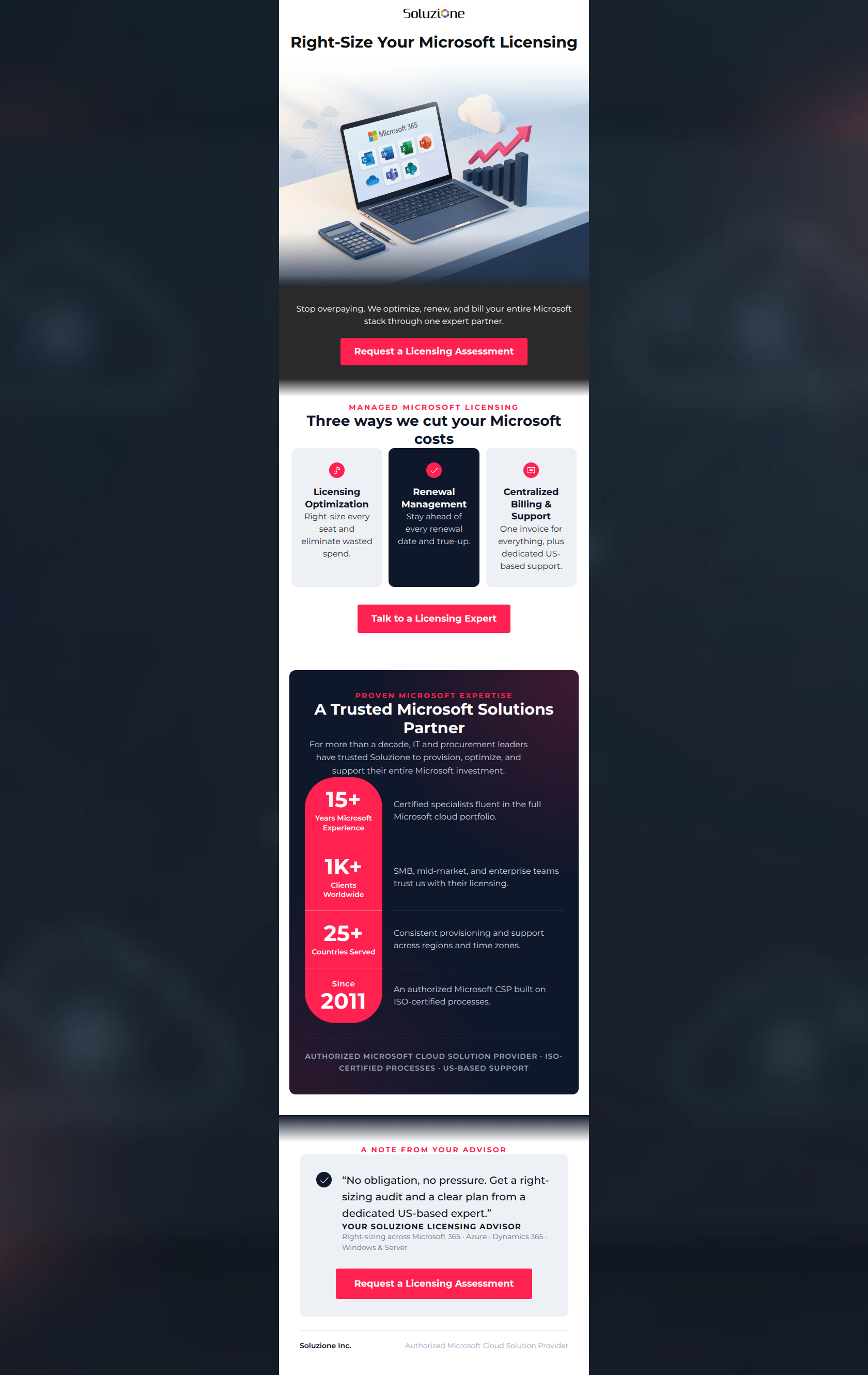
84/100This is a highly effective, tightly written B2B promotional email that speaks directly to the target audience's pain points. The copy is punchy, the structure follows a logical inverted pyramid, and the brand colors are used to create undeniable visual prominence for the primary call-to-action. However, a misconfigured link on the hero image and a slightly generic, non-premium aesthetic in the top graphic hold it back from top-tier execution.
Create Your Own
Generate professional email designs like this one in seconds with Kopi AI.
Email Details
- Subject Line
- Are you overpaying for Microsoft licenses?
- Brand
- Soluzione
- Industry
- SaaS & Software
- Email Type
- Promotional
- Created
- July 10, 2026
Brand Colors
Email Copy
Right-Size Your Microsoft Licensing
Stop overpaying. We optimize, renew, and bill your entire Microsoft stack through one expert partner.
→ Request a Licensing Assessment
Why This Email Works
This is a highly effective, tightly written B2B promotional email that speaks directly to the target audience's pain points. The copy is punchy, the structure follows a logical inverted pyramid, and the brand colors are used to create undeniable visual prominence for the primary call-to-action. However, a misconfigured link on the hero image and a slightly generic, non-premium aesthetic in the top graphic hold it back from top-tier execution.
Hero (top/initial part) Impact
65/100- The H1 is direct, benefit-driven, and perfectly tailored to the IT Director persona.
- The overall layout of the top section is clean and gives the headline room to breathe.
Content Structure & Flow
85/100- Excellent use of the inverted pyramid framework.
- The inclusion of a 'Trust' section (Stats) perfectly bridges the gap between the service offering and the final push for an assessment.
Visual Hierarchy & Layout
82/100- The triptych layout effectively breaks down three complex services into easily digestible, scannable units.
- Excellent contrast between the dark backgrounds and the bright pink-red (#FF214F) accents and buttons.
Call-to-Action Strength
75/100- Brilliant use of repetition; placing the CTA at the top, middle, and bottom ensures the user is never far from the conversion point.
- The button color is highly contrasting, passing the squint test with ease.
Message Clarity & Tone
92/100- Zero corporate jargon or fluff; the copy gets straight to the financial and operational benefits.
- The author sign-off effectively lowers the temperature, offering a 'no obligation, no pressure' close.
Readability & Scannability
88/100- Great use of formatting (cards, large numbers) to prevent 'wall of text' fatigue.
- Short, punchy sentences ensure the reader's eye keeps moving downward.
Offer & Value Proposition
85/100- The offer is highly relevant to the specific pain point of 'license sprawl'.
- It frames the interaction as consultative rather than purely transactional.
Personalization & Audience Fit
90/100- Hits all the major psychographic triggers: cost reduction, simplification (one invoice), and reliable support.
- The professional, capable tone matches the expectations of a B2B enterprise buyer.
Copy Conciseness & Word Economy
95/100- The subheadline 'Stop overpaying. We optimize, renew, and bill your entire Microsoft stack through one expert partner.' is a masterclass in concise value delivery.
- No throat-clearing or wasted introductory sentences.
Quick Wins
- Change the hero image href to match the destination of the primary CTA buttons.
- Change the dark grey background color (#2a2a2a) in the second section to the brand's deep slate navy (#0F172A) for consistency.
- Unify the middle CTA text ('Talk to a Licensing Expert') to match the others ('Request a Licensing Assessment') for absolute clarity.



Create Professional Email Designs
Generate beautiful, on-brand email designs in seconds. Just enter your brand URL and let AI do the rest.