Beauty & Skincare Welcome Email Template
“An introduction to Aesop”
Design Score
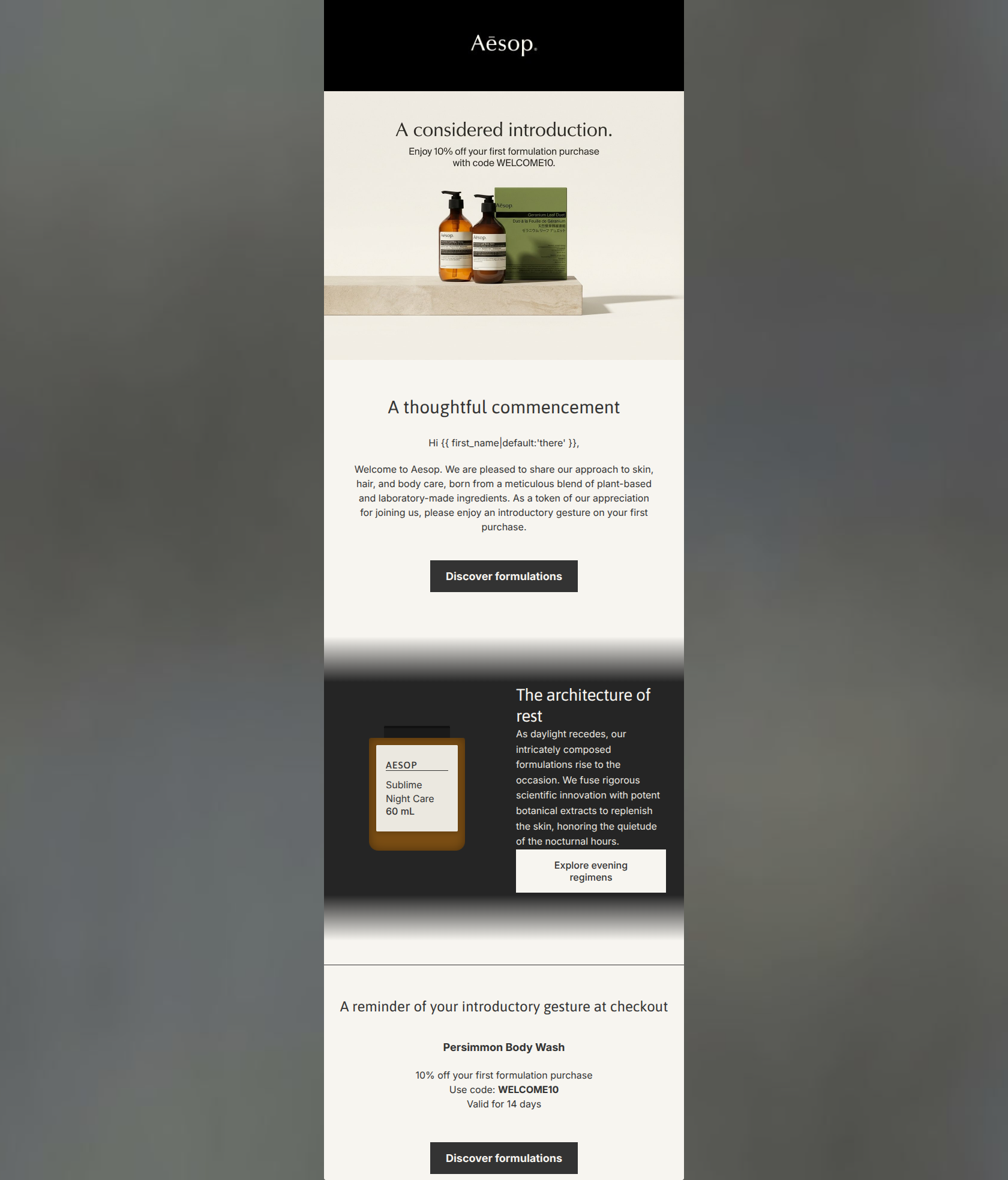
83/100An exceptionally on-brand welcome email that flawlessly executes Aesop's 'intellectual apothecary' aesthetic. The visual hierarchy, typography, and negative space are masterclasses in luxury restraint. However, the email leans slightly too far into brand marketing at the expense of direct conversion best practices. The calls-to-action are passive, the secondary CTA competes visually with the primary, and the core 10% welcome offer is fragmented across an embedded image and a bottom block, forcing the reader to work slightly harder than necessary to connect the dots.
Create Your Own
Generate professional email designs like this one in seconds with Kopi AI.
Email Details
- Subject Line
- An introduction to Aesop
- Brand
- Aesop
- Industry
- Beauty & Skincare
- Email Type
- Welcome
- Created
- March 20, 2026
Brand Colors
Email Copy
A thoughtful commencement
Hi there,
Welcome to Aesop. We are pleased to share our approach to skin, hair, and body care, born from a meticulous blend of plant-based and laboratory-made ingredients. As a token of our appreciation for joining us, please enjoy an introductory gesture on your first purchase.
→ Discover formulations
Workspace clarity
A sensory reprieve for the busy mind.
→ Explore
Immediate calm
Formulations to elevate your professional environment.
→ Discover
A reminder of your introductory gesture at checkout
Persimmon Body Wash
10% off your first formulation purchase Use code: WELCOME10 Valid for 14 days
→ Discover formulations
Why This Email Works
An exceptionally on-brand welcome email that flawlessly executes Aesop's 'intellectual apothecary' aesthetic. The visual hierarchy, typography, and negative space are masterclasses in luxury restraint. However, the email leans slightly too far into brand marketing at the expense of direct conversion best practices. The calls-to-action are passive, the secondary CTA competes visually with the primary, and the core 10% welcome offer is fragmented across an embedded image and a bottom block, forcing the reader to work slightly harder than necessary to connect the dots.
Hero (top/initial part) Impact
82/100- Establishes immediate brand identity with signature product imagery and styling.
- Answers 'what is in it for me' right away by leading with the 10% discount.
Content Structure & Flow
78/100- Excellent use of the 'Inverted Pyramid' principle within individual content blocks.
- The dedicated offer reminder block at the bottom acts as a strong safety net for scrollers.
Visual Hierarchy & Layout
95/100- Flawless adherence to the brand's 'intellectual apothecary' aesthetic.
- High-contrast text and buttons ensure effortless scanning and clear distinction between content zones.
- The muted, sophisticated color palette feels premium and luxurious.
Call-to-Action Strength
72/100- Buttons possess excellent color contrast against the off-white background.
- Consistent button styling (sharp corners, uniform padding) reinforces the brand's precise visual identity.
Message Clarity & Tone
96/100- A highly distinctive, literary brand voice that commands respect and communicates luxury.
- Transforms a standard 'welcome discount' into a premium 'introductory gesture'.
Readability & Scannability
90/100- Excellent use of negative space around text blocks prevents cognitive overload.
- Headings and body text are clearly distinguished by size and weight.
- Promo code is isolated and bolded for immediate recognition.
Offer & Value Proposition
85/100- Clear time constraint ('Valid for 14 days') creates actionable urgency.
- Strong value proposition clearly linking botanical ingredients with scientific efficacy.
Personalization & Audience Fit
84/100- Basic personalization is present and functions flawlessly as a respectful greeting.
- The overall execution speaks directly to the customer's desire for a curated, elevated self-care ritual.
Quick Wins
- Change the secondary 'Read our methodology' button to a text link to remove visual competition with the primary shopping CTAs.
- Update the final CTA button text in the bottom offer block from 'Discover formulations' to 'Redeem your 10% off' to create a stronger transactional finish.
- Ensure the promo code and 10% off messaging are included as live text in the hero section, rather than being baked exclusively into the header image.



Create Professional Email Designs
Generate beautiful, on-brand email designs in seconds. Just enter your brand URL and let AI do the rest.