Food & Beverage Promotional Email Template
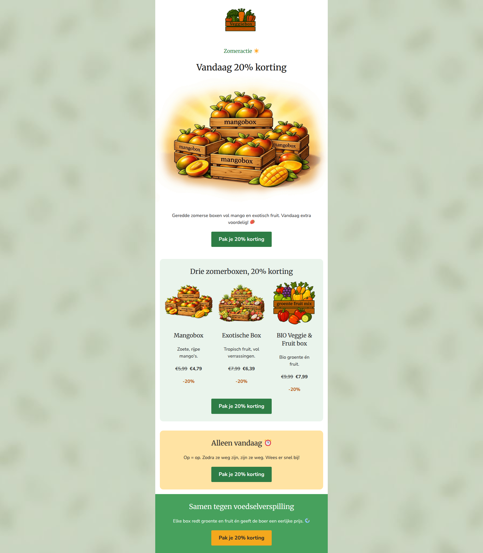
“☀️ Alleen vandaag: 20% korting op 3 zomerboxen”
Design Score
82/100This is a highly effective, punchy promotional email that gets straight to the point. It utilizes a clear, singular offer and relentless CTA repetition to drive a specific action. The visual blocking is strong, and the pricing hierarchy is executed perfectly. However, the email slightly dilutes its brand identity by leaning on generic 'summer sale' messaging rather than connecting the discount to its core 'food rescue' mission, and the centered text alignment creates minor readability friction in the product blocks.
Create Your Own
Generate professional email designs like this one in seconds with Kopi AI.
Email Details
- Subject Line
- ☀️ Alleen vandaag: 20% korting op 3 zomerboxen
- Brand
- Veggiebox
- Industry
- Food & Beverage
- Email Type
- Promotional
- Created
- July 1, 2026
Brand Colors
Email Copy
Preview text: Mangobox, Exotische Box & BIO Veggie & Fruit box — nu 20% korting. Op = op! 🥭☀️
Zomeractie ☀️
Vandaag 20% korting
Geredde zomerse boxen vol mango en exotisch fruit. Vandaag extra voordelig! 🥭
→ Pak je 20% korting
Drie zomerboxen, 20% korting
Mangobox
Zoete, rijpe mango's.
€5,99 €4,79
-20%
Exotische Box
Tropisch fruit, vol verrassingen.
€7,99 €6,39
-20%
BIO Veggie & Fruit box
Bio groente én fruit.
€9,99 €7,99
-20%
→ Pak je 20% korting
Alleen vandaag ⏰
Op = op. Zodra ze weg zijn, zijn ze weg. Wees er snel bij!
→ Pak je 20% korting
Samen tegen voedselverspilling
Elke box redt groente en fruit én geeft de boer een eerlijke prijs. 🌍
→ Pak je 20% korting
Why This Email Works
This is a highly effective, punchy promotional email that gets straight to the point. It utilizes a clear, singular offer and relentless CTA repetition to drive a specific action. The visual blocking is strong, and the pricing hierarchy is executed perfectly. However, the email slightly dilutes its brand identity by leaning on generic 'summer sale' messaging rather than connecting the discount to its core 'food rescue' mission, and the centered text alignment creates minor readability friction in the product blocks.
Hero (top/initial part) Impact
75/100- Unambiguous headline that immediately communicates the primary offer.
- Effective use of a pre-header element ('Zomeractie ☀️') to set context.
Content Structure & Flow
85/100- Logical sequencing of information that mirrors a buyer's journey.
- Clear demarcation of sections using alternating background colors.
Visual Hierarchy & Layout
78/100- Textbook execution of pricing hierarchy (Original Price -> New Price -> Savings).
- Effective use of distinct background colors to separate structural blocks.
Call-to-Action Strength
95/100- Relentless consistency in CTA copy ('Pak je 20% korting').
- Brilliant use of an alternate button color (orange) in the footer to maintain high contrast against the brand green.
- No competing secondary actions; a pure, singular focus on the primary goal.
Message Clarity & Tone
80/100- Friendly, approachable tone that matches the established brand voice.
- Immediate clarity on the financial benefit to the reader.
Readability & Scannability
78/100- Short, punchy sentences that respect the reader's time.
- Strong typographic contrast between headings and body text.
Offer & Value Proposition
90/100- Strong, clear financial incentive.
- Excellent use of urgency and scarcity to drive immediate action.
- Doing the 'mental math' for the user by showing the exact discounted price.
Personalization & Audience Fit
70/100- Directly addresses the primary audience pain point: affordability of fresh produce.
Copy Conciseness & Word Economy
82/100- Minimal fluff; gets straight to the offer and the products.
- Product descriptions are delightfully brief.
Quick Wins
- Move the first 'Pak je 20% korting' button and its supporting text directly into the top Hero section.
- Change the text alignment in the three product columns from centered to left-aligned.
- Remove the redundant phrase 'Zodra ze weg zijn, zijn ze weg' from the urgency section.


Create Professional Email Designs
Generate beautiful, on-brand email designs in seconds. Just enter your brand URL and let AI do the rest.