SaaS & Software Welcome Email Template
“A little welcome gift, just for you ✨”
Design Score
81/100This is a visually elegant and well-structured welcome email that perfectly matches the 'Parisian Simplicity' brand aesthetic. The use of whitespace, high-contrast CTA buttons, and clear iconography creates a low-friction reading experience. However, a significant logical flaw in the opening copy ('one subscribe away') creates unnecessary cognitive load, and the hero section's layout disconnects the headline from the supporting context and primary action. Correcting these friction points will elevate this from a strong email to an outstanding conversion driver.
Create Your Own
Generate professional email designs like this one in seconds with Kopi AI.
Email Details
- Subject Line
- A little welcome gift, just for you ✨
- Brand
- PlanWithParisAura
- Industry
- SaaS & Software
- Email Type
- Welcome
- Created
- June 8, 2026
Brand Colors
Email Copy
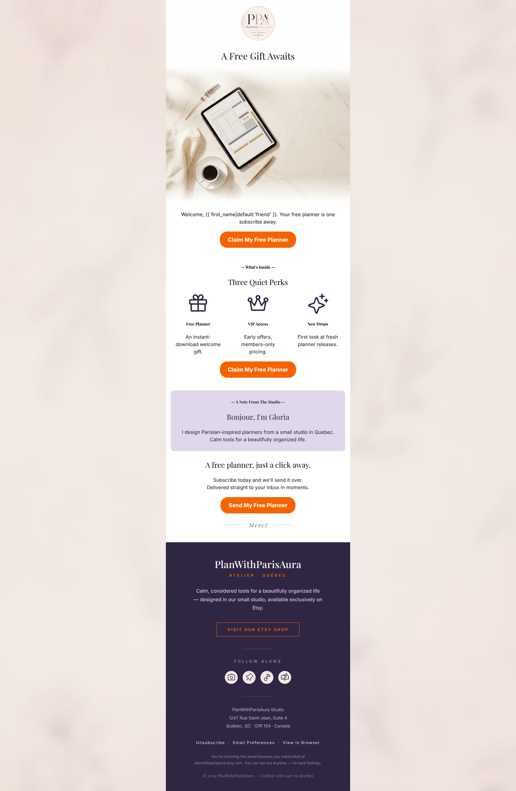
A Free Gift Awaits
Welcome, friend. Your free planner is one subscribe away.
→ Claim My Free Planner
— What's Inside —
Three Quiet Perks
Free Planner
An instant-download welcome gift.
VIP Access
Early offers, members-only pricing.
New Drops
First look at fresh planner releases.
→ Claim My Free Planner
— A Note From The Studio —
Bonjour, I'm Gloria
I design Parisian-inspired planners from a small studio in Quebec. Calm tools for a beautifully organized life.
A free planner, just a click away.
Subscribe today and we'll send it over. Delivered straight to your inbox in moments.
→ Send My Free Planner
Why This Email Works
This is a visually elegant and well-structured welcome email that perfectly matches the 'Parisian Simplicity' brand aesthetic. The use of whitespace, high-contrast CTA buttons, and clear iconography creates a low-friction reading experience. However, a significant logical flaw in the opening copy ('one subscribe away') creates unnecessary cognitive load, and the hero section's layout disconnects the headline from the supporting context and primary action. Correcting these friction points will elevate this from a strong email to an outstanding conversion driver.
1. Hero (top/initial part) Impact
70/100- High-quality, aspirational imagery that perfectly fits the brand's luxury-tech aesthetic.
- Clear, benefit-driven headline that immediately sets expectations.
2. Content Structure & Flow
85/100- Logical progression from high-value offer to supporting brand context.
- Excellent use of clear section breaks (dividers and background color changes) to organize content.
3. Visual Hierarchy & Layout
88/100- Generous whitespace aligns perfectly with the 'calm, sophisticated' brand voice.
- CTA buttons are the most visually prominent elements in the email.
4. Call-to-Action Strength
95/100- Relentless focus on a single primary destination.
- High-contrast button color ensures the CTAs pass the 'squint test' with flying colors.
- Button copy is specific and benefit-driven, not generic.
5. Message Clarity & Tone
65/100- Brand voice is distinct, calm, and perfectly aligned with the 'Parisian Simplicity' aesthetic.
- The personal note from the founder ('Bonjour, I'm Gloria') adds excellent human touch.
6. Readability & Scannability
90/100- Avoids large blocks of text; uses icons and headings to break up information.
- High contrast typography (dark text on light backgrounds) throughout the main body.
7. Offer & Value Proposition
82/100- Offer is front-and-center, not buried.
- Clearly outlines the long-term value of the email subscription beyond the initial freebie.
8. Personalization & Audience Fit
80/100- Design, imagery, and copy tone completely align with the stated target demographic.
- Includes basic first-name personalization.
9. Copy Conciseness & Word Economy
88/100- Frictionless reading experience due to tight, edited copy.
- No redundant paragraphs explaining the product features; relies entirely on benefit-driven bullets.
Quick Wins
- Fix the logical error in the opening copy: change 'one subscribe away' to 'one click away' or 'ready to download'.
- Add one descriptive word to the H1 or introductory text to specify the type of free planner (e.g., 'Daily', 'Weekly').
- Change the fallback personalization from 'friend' to something more tailored, or remove the fallback entirely.




Create Professional Email Designs
Generate beautiful, on-brand email designs in seconds. Just enter your brand URL and let AI do the rest.