Jewelry & Accessories Welcome Email Template
“A Guided Tour of Our Most Iconic Designs”
Design Score
67/100This email establishes a strong initial visual identity with the iconic Tiffany Blue and elegant imagery, but it stumbles in its execution of luxury tone and layout hierarchy. The biggest strength is its clean, museum-like product presentation, while the most glaring weakness is the clumsy repetition of the discount code and a jarringly casual tone in the greeting and sign-off. Color & Contrast Notes: The palette successfully uses the signature Tiffany Blue to create instant brand recognition. The primary CTAs stand out well, but the body text against the light grey card background in the 'Elegant Pairings' section could be slightly darker to ensure effortless readability. The stark buttons are highly visible but feel a bit visually heavy compared to the delicate typography.
Create Your Own
Generate professional email designs like this one in seconds with Kopi AI.
Email Details
- Subject Line
- A Guided Tour of Our Most Iconic Designs
- Brand
- Tiffany & Co.
- Industry
- Jewelry & Accessories
- Email Type
- Welcome
- Created
- March 13, 2026
Brand Colors
Email Copy
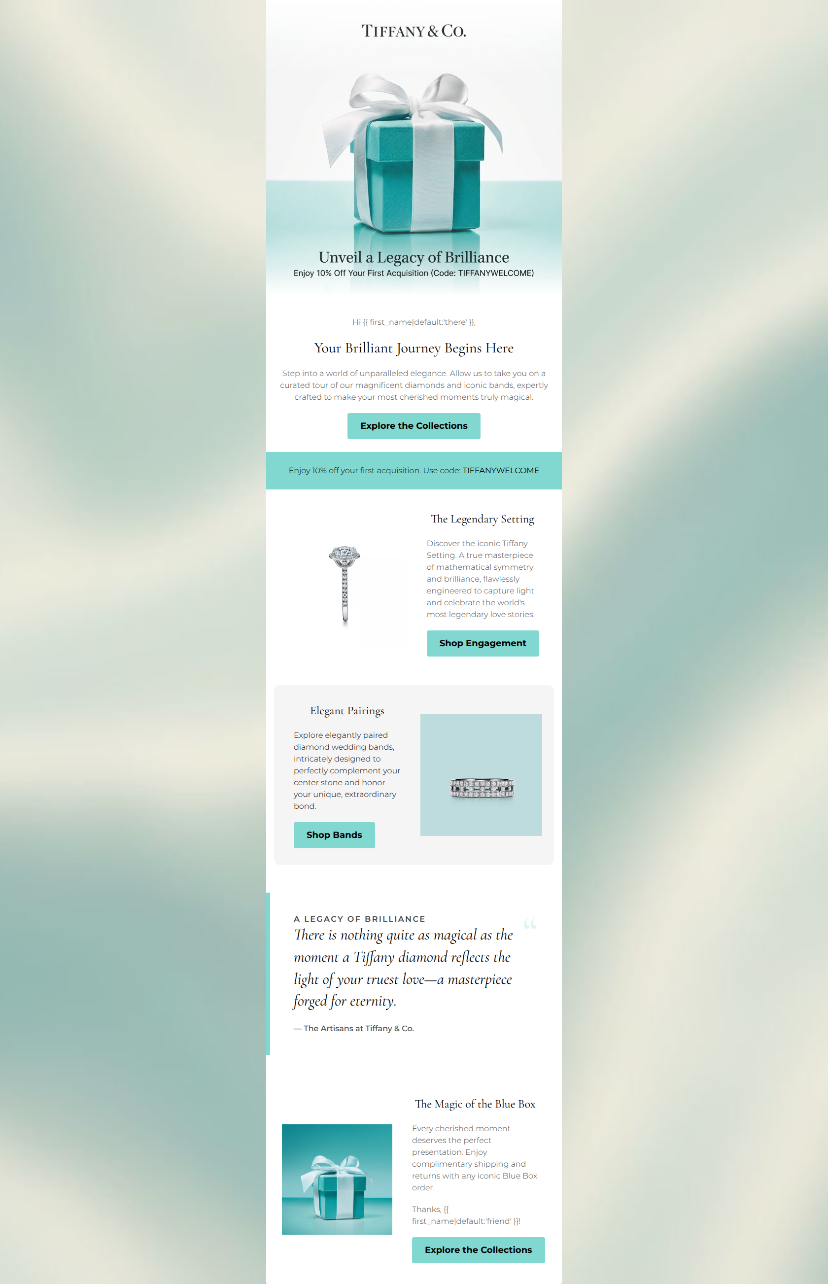
Hi there,
Your Brilliant Journey Begins Here
Step into a world of unparalleled elegance. Allow us to take you on a curated tour of our magnificent diamonds and iconic bands, expertly crafted to make your most cherished moments truly magical.
→ Explore the Collections
Enjoy 10% off your first acquisition. Use code: TIFFANYWELCOME
The Legendary Setting
Discover the iconic Tiffany Setting. A true masterpiece of mathematical symmetry and brilliance, flawlessly engineered to capture light and celebrate the world's most legendary love stories.
→ Shop Engagement
Elegant Pairings
Explore elegantly paired diamond wedding bands, intricately designed to perfectly complement your center stone and honor your unique, extraordinary bond.
→ Shop Bands
The Magic of the Blue Box
Every cherished moment deserves the perfect presentation. Enjoy complimentary shipping and returns with any iconic Blue Box order.
Thanks, friend!
→ Explore the Collections
Why This Email Works
This email establishes a strong initial visual identity with the iconic Tiffany Blue and elegant imagery, but it stumbles in its execution of luxury tone and layout hierarchy. The biggest strength is its clean, museum-like product presentation, while the most glaring weakness is the clumsy repetition of the discount code and a jarringly casual tone in the greeting and sign-off. Color & Contrast Notes: The palette successfully uses the signature Tiffany Blue to create instant brand recognition. The primary CTAs stand out well, but the body text against the light grey card background in the 'Elegant Pairings' section could be slightly darker to ensure effortless readability. The stark buttons are highly visible but feel a bit visually heavy compared to the delicate typography.
Hero Impact
65/100- Instantly recognizable brand imagery leverages the emotional weight of the Tiffany Blue Box.
- The 10% offer is presented high up in the visual hierarchy.
Content Structure & Flow
60/100- The alternating left-right layout for the product blocks creates a pleasing, scannable rhythm.
- The progression from the hero to engagement rings, then matching bands, follows a natural customer journey.
Visual Hierarchy & Layout
75/100- Excellent use of negative space allows the intricate details of the jewelry to breathe.
- CTAs are visually distinct and draw the eye effectively against the lighter backgrounds.
Call-to-Action Strength
70/100- High contrast on the buttons makes the desired action unmistakable.
- The middle buttons ('Shop Engagement', 'Shop Bands') are highly specific and align perfectly with their adjacent copy.
Message Clarity & Tone
55/100- Words like 'masterpiece,' 'mathematical symmetry,' and 'extraordinary bond' perfectly align with Tiffany's authoritative and romantic brand voice.
Readability & Scannability
75/100- Paragraphs are kept short, making them easy to digest without cognitive overload.
- Clear, distinct subheadings guide the reader's eye down the page.
Offer & Value Proposition
70/100- The 10% welcome offer code is explicit and easy to find.
- Complimentary shipping and returns are highlighted, acting as a strong risk-reversal for a high-ticket purchase.
Personalization & Audience Fit
65/100- The focus on engagement and weddings perfectly targets a high-intent segment of Tiffany's audience.
Quick Wins
- Remove the redundant teal banner that repeats the 10% off code; it clutters the hierarchy.
- Delete the 'Thanks, {{ first_name... }}!' sign-off at the bottom to restore the authoritative brand tone.
- Change the bottom CTA from 'Explore the Collections' to 'Shop Gifts' or 'Discover the Blue Box' to match the adjacent copy.



Create Professional Email Designs
Generate beautiful, on-brand email designs in seconds. Just enter your brand URL and let AI do the rest.