Beauty & Skincare Welcome Email Template
“A considered welcome”
Design Score
84/100This welcome email is a masterclass in brand consistency, perfectly capturing Aesop's poetic, architectural, and quietly confident identity. The visual aesthetics, strict geometry, and word economy are excellent. The repetition of a single, clear primary CTA ('Explore the range') is a textbook conversion practice. However, it leaves money on the table by omitting a compelling conversion incentive (like the complimentary sample mentioned in your site context) and suffers from minor grid alignment inconsistencies that slightly disrupt the clinical visual flow.
Create Your Own
Generate professional email designs like this one in seconds with Kopi AI.
Email Details
- Subject Line
- A considered welcome
- Brand
- Aesop
- Industry
- Beauty & Skincare
- Email Type
- Welcome
- Created
- May 8, 2026
Brand Colors
Email Copy
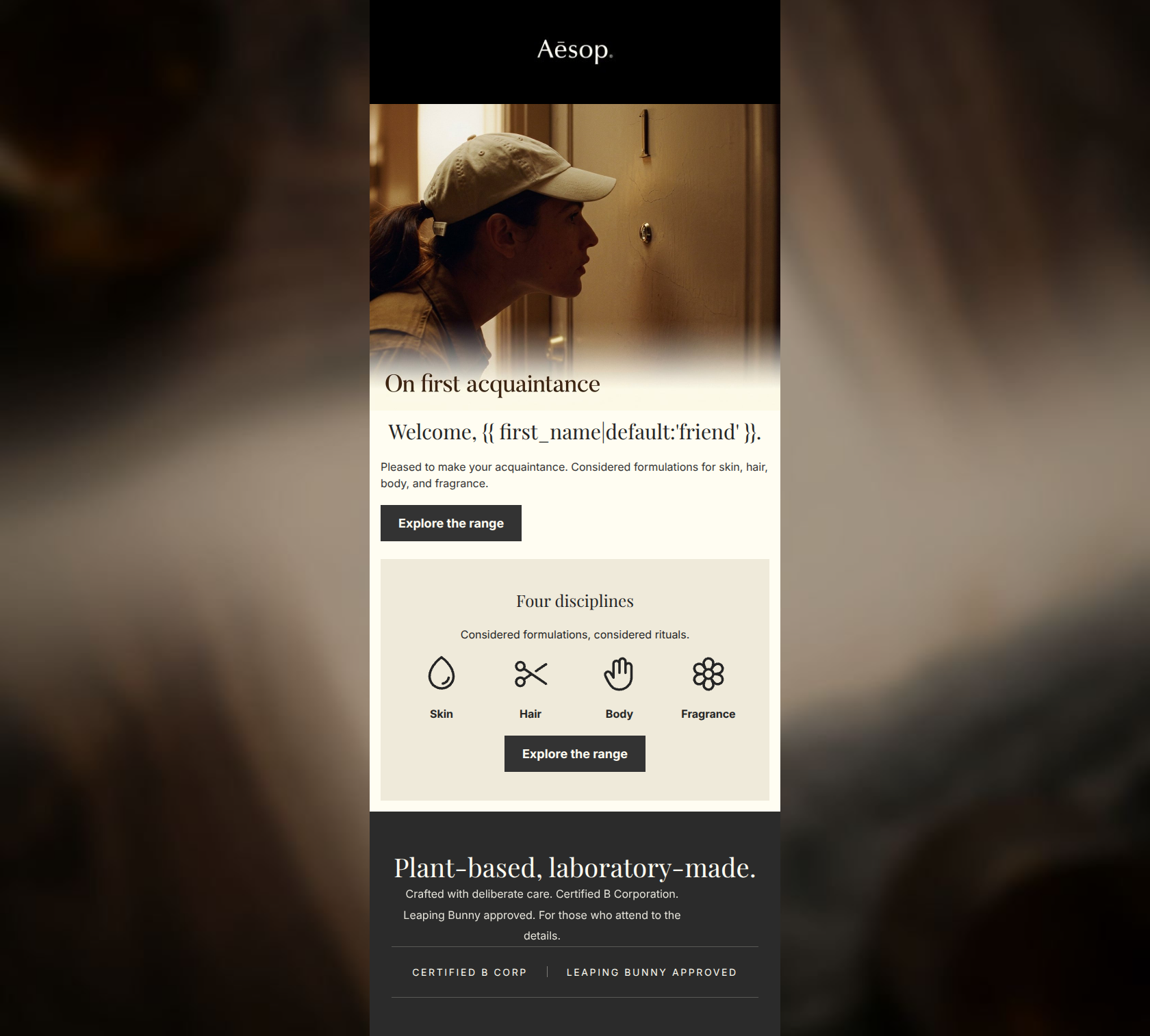
Welcome, friend.
Pleased to make your acquaintance. Considered formulations for skin, hair, body, and fragrance.
→ Explore the range
Four disciplines
Considered formulations, considered rituals.
Skin
Hair
Body
Fragrance
→ Explore the range
Why This Email Works
This welcome email is a masterclass in brand consistency, perfectly capturing Aesop's poetic, architectural, and quietly confident identity. The visual aesthetics, strict geometry, and word economy are excellent. The repetition of a single, clear primary CTA ('Explore the range') is a textbook conversion practice. However, it leaves money on the table by omitting a compelling conversion incentive (like the complimentary sample mentioned in your site context) and suffers from minor grid alignment inconsistencies that slightly disrupt the clinical visual flow.
Hero (top/initial part) Impact
85/100- The imagery and overlay text perfectly match the brand's 'quiet discovery' aesthetic.
- The primary CTA is immediately visible above the fold.
Content Structure & Flow
82/100- Logical progression from brand introduction to product exploration.
- Use of a distinct background color (#EFEADA) for the disciplines card creates a clear, scannable section break.
Visual Hierarchy & Layout
80/100- Excellent use of negative space, preventing cognitive overload.
- Strict adherence to square corners and minimal borders fits the brand's visual identity.
Call-to-Action Strength
92/100- Perfect consistency in CTA phrasing across the email.
- High-contrast dark buttons on light backgrounds ensure the action is unmissable.
Message Clarity & Tone
88/100- Tone is sophisticated, quiet, and avoids hyperbole, perfectly matching the brand psychographics.
- The trust signals (B Corp, Leaping Bunny) are integrated smoothly without feeling boastful.
Readability & Scannability
85/100- High contrast ratios between text and background colors.
- The 'Four disciplines' section uses visual anchors (icons) to make the text highly scannable.
Offer & Value Proposition
70/100- Strong reliance on brand ethos (B Corp, cruelty-free) as a value driver, which resonates with the target audience.
Personalization & Audience Fit
80/100- The overarching aesthetic and vocabulary choices speak directly to the intellectual and sensory desires of the target demographic.
Copy Conciseness & Word Economy
88/100- Zero filler adjectives.
- Highly distilled copy that respects the reader's time.
Quick Wins
- Change the fallback in the personalization tag from 'friend' to something more aligned with the brand's clinical/sophisticated tone, or restructure the greeting to avoid a noun fallback.
- Remove the repetitive use of 'Considered formulations' in the second section, replacing it with copy that highlights a different brand pillar.
- Add a final 'Explore the range' text link or button at the very bottom of the dark credential block to catch users who have scrolled to the end.



Create Professional Email Designs
Generate beautiful, on-brand email designs in seconds. Just enter your brand URL and let AI do the rest.