Beauty & Skincare Welcome Email Template
“A considered beginning awaits”
Design Score
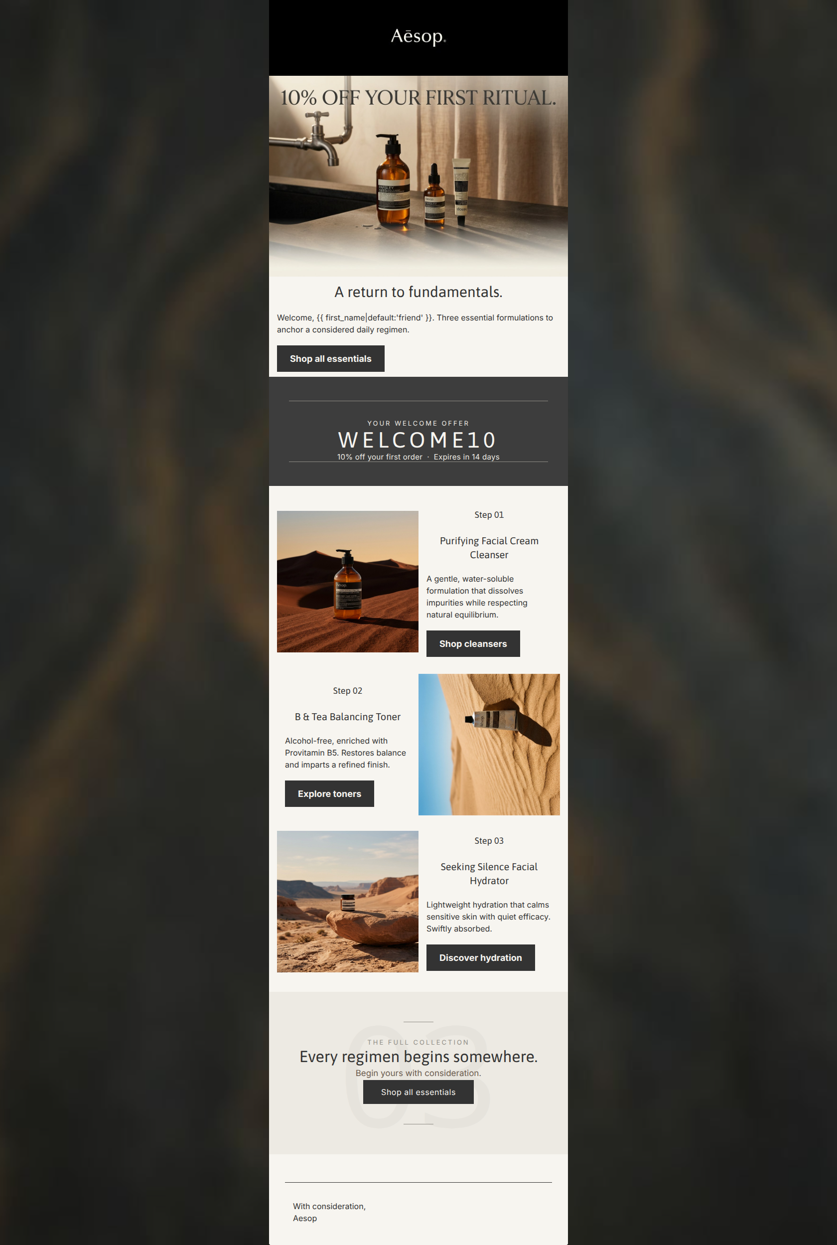
89/100This welcome email is an excellent manifestation of the Aesop brand: elegant, restrained, and highly readable. The structure correctly funnels attention from a clear value proposition (10% off) into an educational, step-by-step product routine that encourages higher AOV (Average Order Value) through regimen adoption. The primary weakness is a slight visual disjointedness between the indoor hero photography and the outdoor product photography, alongside redundant offer messaging at the top of the email. With minor refinements to image cohesion and top-level hierarchy, this email will perform at an elite level.
Create Your Own
Generate professional email designs like this one in seconds with Kopi AI.
Email Details
- Subject Line
- A considered beginning awaits
- Brand
- Aesop
- Industry
- Beauty & Skincare
- Email Type
- Welcome
- Created
- April 6, 2026
Brand Colors
Email Copy
A return to fundamentals.
Welcome, friend. Three essential formulations to anchor a considered daily regimen.
→ Shop all essentials
Step 01
Purifying Facial Cream Cleanser
A gentle, water-soluble formulation that dissolves impurities while respecting natural equilibrium.
→ Shop cleansers
Step 02
B & Tea Balancing Toner
Alcohol-free, enriched with Provitamin B5. Restores balance and imparts a refined finish.
→ Explore toners
Step 03
Seeking Silence Facial Hydrator
Lightweight hydration that calms sensitive skin with quiet efficacy. Swiftly absorbed.
→ Discover hydration
With consideration, Aesop
Why This Email Works
This welcome email is an excellent manifestation of the Aesop brand: elegant, restrained, and highly readable. The structure correctly funnels attention from a clear value proposition (10% off) into an educational, step-by-step product routine that encourages higher AOV (Average Order Value) through regimen adoption. The primary weakness is a slight visual disjointedness between the indoor hero photography and the outdoor product photography, alongside redundant offer messaging at the top of the email. With minor refinements to image cohesion and top-level hierarchy, this email will perform at an elite level.
Hero Impact
80/100- Clear, high-quality imagery that immediately identifies the brand.
- Strong headline ('A return to fundamentals') that speaks directly to the customer's desire for simplicity.
Content Structure & Flow
92/100- Logical progression from greeting -> incentive -> product education -> final conversion net.
- The numbering system (Step 01, Step 02) creates a psychological completion loop, encouraging readers to scroll through all three.
Visual Hierarchy & Layout
85/100- Excellent use of negative space.
- The dark promo banner naturally acts as a visual anchor and section divider.
Call-to-Action Strength
90/100- Flawless color contrast for button legibility.
- Action-oriented, descriptive copy that tells the user exactly what to expect upon clicking.
Message Clarity & Tone
96/100- Perfect alignment with the brand's erudite, sophisticated tone.
- Avoids cheap marketing hyperbole, building trust with a skeptical, high-end consumer.
Readability & Scannability
94/100- Clear differentiation between headings and body copy.
- Short paragraph lengths prevent the 'wall of text' effect.
Offer & Value Proposition
90/100- Strong, clear incentive for first-time buyers.
- Subtle but effective use of urgency.
Personalization & Audience Fit
88/100- Copy addresses the specific pain points of the target audience (seeking silence, restoring balance).
Copy Conciseness & Word Economy
95/100- Zero fluff or filler adjectives.
- Focuses immediately on outcomes ('calms sensitive skin', 'dissolves impurities').
Quick Wins
- Remove the '10% OFF YOUR FIRST RITUAL' text overlaid on the hero image to eliminate redundancy with the promo banner.
- Change the dynamic tag fallback from 'friend' to something that better reflects the brand's formal tone (e.g., just 'Welcome.').
- Ensure consistent pixel padding between the body text and CTA buttons in the 3-step product section.



Create Professional Email Designs
Generate beautiful, on-brand email designs in seconds. Just enter your brand URL and let AI do the rest.