Design Score
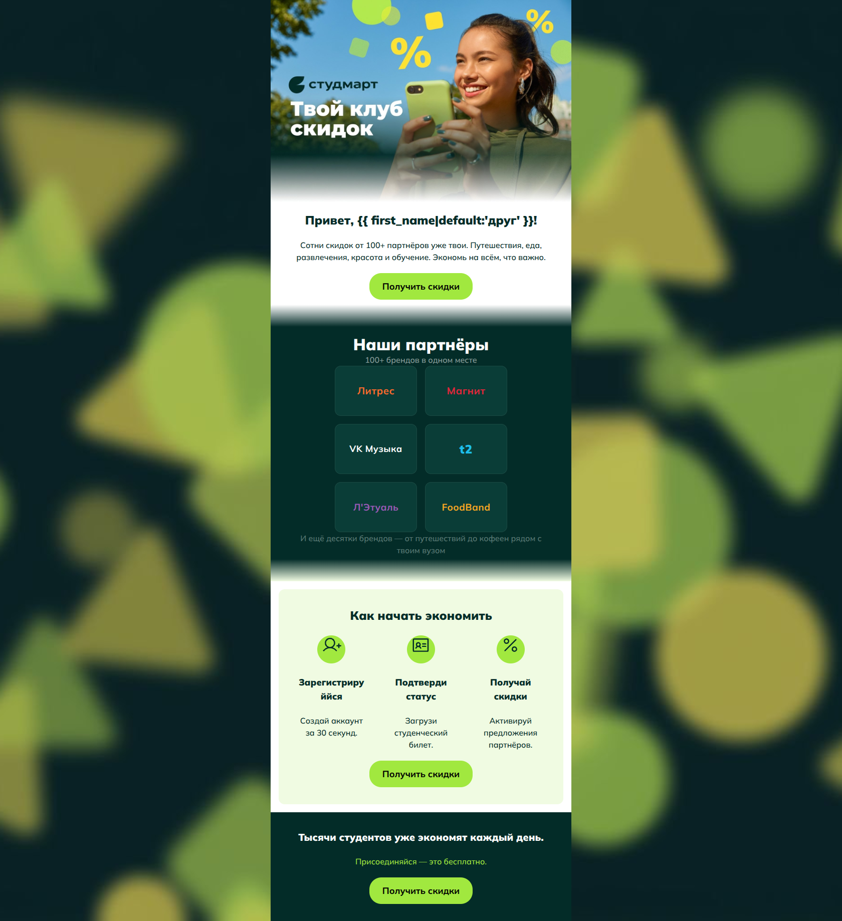
85/100This is a strong, highly effective conversion email. It immediately establishes a vibrant, Gen-Z-appropriate tone, uses color blocking masterfully to guide the eye, and adheres perfectly to best practices for Call-to-Action consistency. The inverted pyramid structure flows logically from the value proposition down to social proof, process, and a final urgency push. The primary friction points are minor visual layout constraints in the icon grid and a reliance on abstract claims ('100+ brands') rather than concrete, irresistible deal teasers.
Create Your Own
Generate professional email designs like this one in seconds with Kopi AI.
Email Details
- Subject Line
- Добро пожаловать в клуб скидок 🎉
- Brand
- Studmart
- Industry
- Other
- Email Type
- Welcome
- Created
- April 21, 2026
Brand Colors
Email Copy
Привет, друг!
Сотни скидок от 100+ партнёров уже твои. Путешествия, еда, развлечения, красота и обучение. Экономь на всём, что важно.
→ Получить скидки
Как начать экономить
Зарегистрируййся
Создай аккаунт за 30 секунд.
Подтверди статус
Загрузи студенческий билет.
Получай скидки
Активируй предложения партнёров.
→ Получить скидки
Тысячи студентов уже экономят каждый день.
Присоединяйся — это бесплатно.
→ Получить скидки
Why This Email Works
This is a strong, highly effective conversion email. It immediately establishes a vibrant, Gen-Z-appropriate tone, uses color blocking masterfully to guide the eye, and adheres perfectly to best practices for Call-to-Action consistency. The inverted pyramid structure flows logically from the value proposition down to social proof, process, and a final urgency push. The primary friction points are minor visual layout constraints in the icon grid and a reliance on abstract claims ('100+ brands') rather than concrete, irresistible deal teasers.
Hero Impact
85/100- High-energy, relevant lifestyle imagery that matches the Gen-Z target audience.
- Clear, immediate establishment of the core value proposition (saving money on essentials and fun).
Content Structure & Flow
92/100- Logical narrative progression from 'What is it?' to 'Who is it with?' to 'How do I get it?'.
- Excellent use of color-blocked sections to visually segment the narrative.
Visual Hierarchy & Layout
78/100- Strong visual rhythm created by alternating light and dark backgrounds.
- The 3-column icon setup effectively breaks down a multi-step process into bite-sized, approachable visual chunks.
Call-to-Action Strength
98/100- Perfect consistency in CTA copy and destination.
- Excellent visual prominence; the buttons easily pass the 'squint test'.
- Action-oriented verb choice that focuses on the benefit to the user.
Message Clarity & Tone
85/100- Conversational and accessible language with zero corporate jargon.
- Directly addresses the primary pain point: the need to save money.
Readability & Scannability
75/100- Excellent use of short, punchy sentences.
- High contrast text-to-background ratios in almost all areas.
Offer & Value Proposition
82/100- Highlights the variety of categories (Travel, food, entertainment) to ensure broad appeal.
- Clearly states that joining is free at the bottom.
Personalization & Audience Fit
88/100- Visually aligned with Gen-Z aesthetics (neon accents, dark mode blocks).
- Directly targets the student lifestyle with relevant categories.
Copy Conciseness & Word Economy
92/100- Zero filler text.
- Microcopy under the step-by-step guide is tight and removes objections (e.g., 'за 30 секунд').
Quick Wins
- Change the subheading 'Зарегистрируйся' to 'Регистрация' to prevent the awkward mid-word text wrap.
- Replace the text-based partner names in the dark grid with actual brand logos to speed up visual recognition.




Create Professional Email Designs
Generate beautiful, on-brand email designs in seconds. Just enter your brand URL and let AI do the rest.