Food & Beverage Product Launch Email Template
“75% less sugar. 100% more dead.”
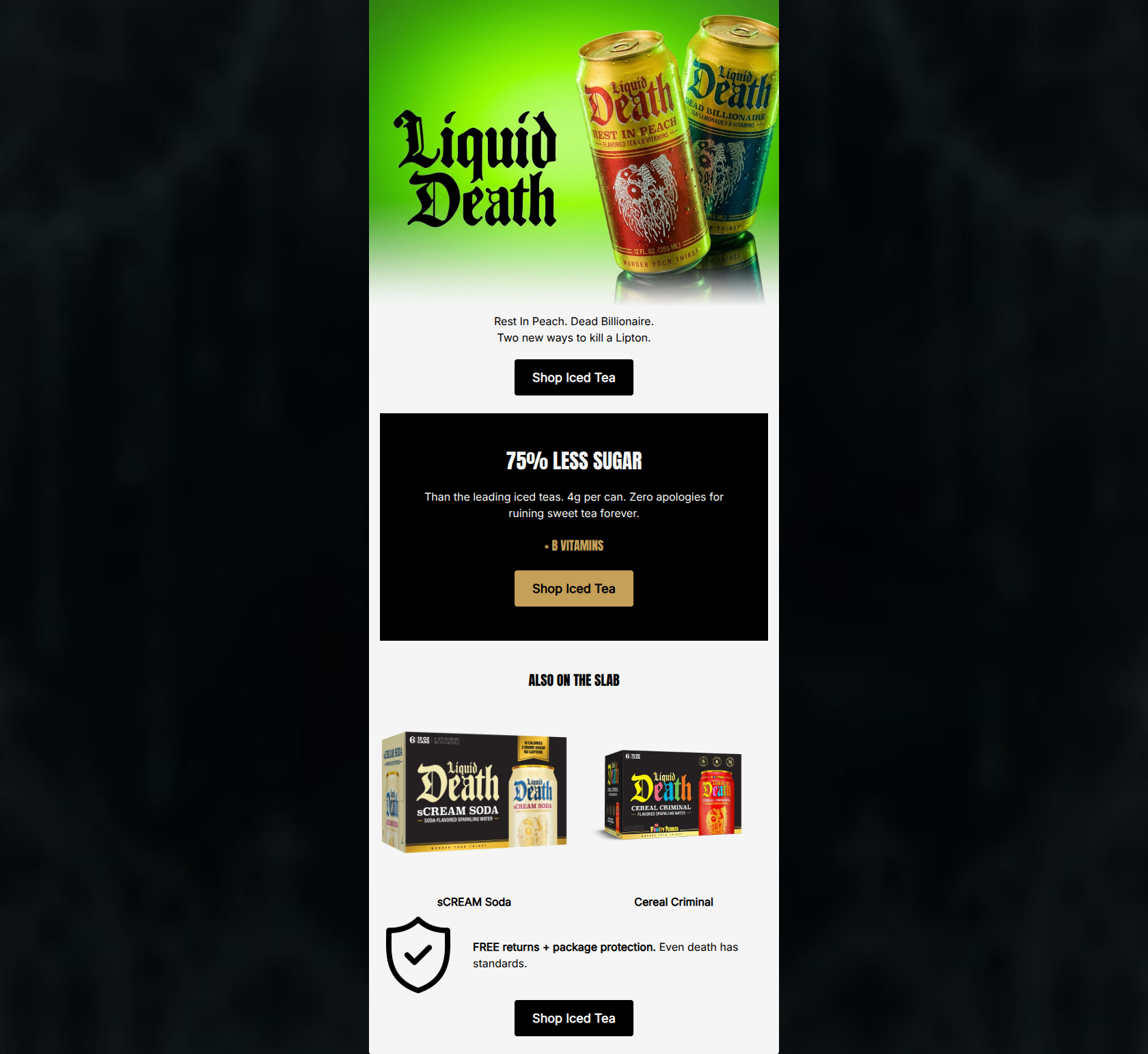
Design Score
91/100This is an outstanding promotional email that masterfully balances a highly specific, aggressive brand voice with clear, conversion-focused fundamentals. The value proposition (75% less sugar) is delivered with punchy, zero-fluff copy, and the visual hierarchy effectively draws the eye down the page. Color and contrast are leveraged perfectly, utilizing stark black-and-white blocking and a high-visibility gold button to create a premium, scannable experience. The only notable flaw is a structural misstep at the very end: placing the final primary CTA ('Shop Iced Tea') directly below a cross-sell for a different product category, which creates localized friction. Fixing this sequence will make a near-perfect email flawless.
Create Your Own
Generate professional email designs like this one in seconds with Kopi AI.
Email Details
- Subject Line
- 75% less sugar. 100% more dead.
- Brand
- Liquid Death
- Industry
- Food & Beverage
- Email Type
- Product Launch
- Created
- May 26, 2026
Brand Colors
Email Copy
Rest In Peach. Dead Billionaire. Two new ways to kill a Lipton.
→ Shop Iced Tea
75% LESS SUGAR
Than the leading iced teas. 4g per can. Zero apologies for ruining sweet tea forever.
+ B VITAMINS
→ Shop Iced Tea
ALSO ON THE SLAB
sCREAM Soda
Cereal Criminal
FREE returns + package protection. Even death has standards.
→ Shop Iced Tea
Why This Email Works
This is an outstanding promotional email that masterfully balances a highly specific, aggressive brand voice with clear, conversion-focused fundamentals. The value proposition (75% less sugar) is delivered with punchy, zero-fluff copy, and the visual hierarchy effectively draws the eye down the page. Color and contrast are leveraged perfectly, utilizing stark black-and-white blocking and a high-visibility gold button to create a premium, scannable experience. The only notable flaw is a structural misstep at the very end: placing the final primary CTA ('Shop Iced Tea') directly below a cross-sell for a different product category, which creates localized friction. Fixing this sequence will make a near-perfect email flawless.
1. Hero Impact
95/100- High-impact, color-saturated imagery that grabs attention.
- Instantly recognizable brand voice established in the first sentence.
- Clear, immediate framing of the specific product being offered.
2. Content Structure & Flow
75/100- Strong inverted pyramid structure in the upper half.
- Distinct visual separation of the core value proposition.
3. Visual Hierarchy & Layout
92/100- Excellent use of negative space to prevent clutter.
- The gold CTA on the black background is a visual magnet that passes the squint test easily.
- High-contrast text pairings ensure readability across all blocks.
4. Call-to-Action Strength
85/100- Strict adherence to a single primary action/verb.
- High-contrast button designs that look unmistakably clickable.
- Appropriate repetition of the primary goal throughout the scroll depth.
5. Message Clarity & Tone
98/100- Flawless execution of dark-humor tone.
- Maintains perfect clarity regarding what is actually being sold.
6. Readability & Scannability
92/100- Excellent contrast ratios for all live text.
- Short, punchy sentences that respect the reader's time.
- Highly scannable center-aligned layout that funnels the eyes downward.
7. Offer & Value Proposition
95/100- Effective use of hard numbers to ground the marketing claims.
- Clear competitive positioning against 'leading iced teas'.
8. Personalization & Audience Fit
95/100- Deep alignment with the audience's anti-establishment values.
- Visuals and copy work in tandem to reinforce a distinct lifestyle.
9. Copy Conciseness & Word Economy
95/100- Absence of marketing fluff or cliché filler phrases.
- Maximum impact achieved with a minimal word count.
Quick Wins
- Move the final 'Shop Iced Tea' button to sit directly above the 'Also on the slab' cross-sell section to maintain a continuous, logical path for the primary offer.
- Add explicit text links (e.g., 'Shop sCREAM Soda >') directly beneath the cross-sell images so users don't have to guess that the images themselves are the only clickable elements.


Create Professional Email Designs
Generate beautiful, on-brand email designs in seconds. Just enter your brand URL and let AI do the rest.