Outdoor & Sports Promotional Email Template
“Мангал полного роста, который складывается”
Design Score
85/100This is a highly effective, structurally sound promotional email that clearly understands its target audience. The inverted pyramid flow is excellent, and the direct, no-nonsense tone perfectly matches KOLUNDROV's utilitarian brand identity. The email strictly adheres to best practices by repeating a single, clear CTA throughout the scroll. However, it misses a significant conversion opportunity by omitting the 'Dolyame' split-payment option provided in the brand context, and it fails to mention the material quality (thick steel), which is a key differentiator for premium outdoor gear.
Create Your Own
Generate professional email designs like this one in seconds with Kopi AI.
Email Details
- Subject Line
- Мангал полного роста, который складывается
- Brand
- KOLUNDROV
- Industry
- Outdoor & Sports
- Email Type
- Promotional
- Created
- July 10, 2026
Brand Colors
Email Copy
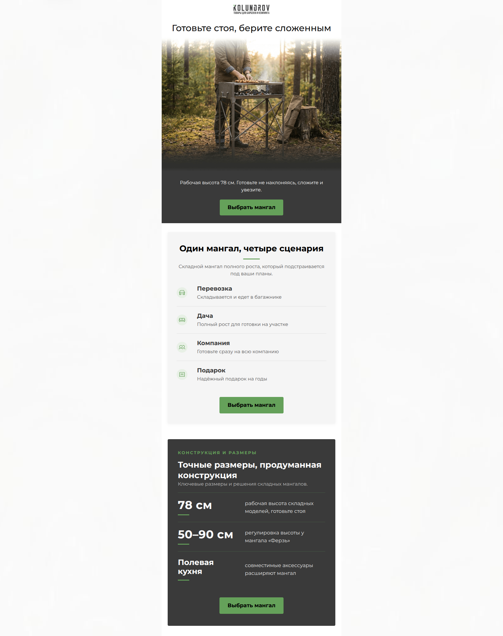
Готовьте стоя, берите сложенным
Рабочая высота 78 см. Готовьте не наклоняясь, сложите и увезите.
→ Выбрать мангал
Why This Email Works
This is a highly effective, structurally sound promotional email that clearly understands its target audience. The inverted pyramid flow is excellent, and the direct, no-nonsense tone perfectly matches KOLUNDROV's utilitarian brand identity. The email strictly adheres to best practices by repeating a single, clear CTA throughout the scroll. However, it misses a significant conversion opportunity by omitting the 'Dolyame' split-payment option provided in the brand context, and it fails to mention the material quality (thick steel), which is a key differentiator for premium outdoor gear.
Hero (top/initial part) Impact
88/100- Headline leads with a massive functional benefit (standing up).
- High-quality, relevant lifestyle imagery that sets the right mood.
Content Structure & Flow
92/100- Excellent pacing; the content is chunked into easily digestible, distinct sections.
- Logical narrative flow from emotional/lifestyle benefits to rational/technical specs.
Visual Hierarchy & Layout
85/100- CTAs visually dominate the sections they are in.
- Icons in the scenarios block help break up the text and guide the eye.
Call-to-Action Strength
98/100- Zero competing actions or distracting secondary links.
- Button contrast is excellent against both the #3A3A3A and #F5F5F5 backgrounds.
- Action-oriented, specific button copy.
Message Clarity & Tone
84/100- Directly addresses a universally understood pain point (working height).
- No-nonsense, masculine tone fits the product category well.
Readability & Scannability
89/100- Excellent use of bullet-style content blocks instead of paragraphs.
- High contrast typography makes reading effortless.
Offer & Value Proposition
70/100- The functional benefit of the product is undeniably clear.
Personalization & Audience Fit
80/100- Deep understanding of the practical scenarios where the product is used.
Copy Conciseness & Word Economy
82/100- No throat-clearing openers or corporate fluff.
- Sentences are short and punchy.
Quick Wins
- Add a brief mention or visual badge for the 'Dolyame' (pay in 4) installment plan near the final CTA to lower the barrier to entry.
- Remove the repetitive 'готовьте стоя' phrase from the final stats block, as the reader already understands this benefit from the hero.
- Tighten the vertical spacing in the 'Four Scenarios' block if rendering on desktop, potentially moving to a 2x2 grid to keep the CTA higher on the screen.



Create Professional Email Designs
Generate beautiful, on-brand email designs in seconds. Just enter your brand URL and let AI do the rest.