Food & Beverage Promotional Email Template
“5–8 kilo gered fruit voor €9,99”
Design Score
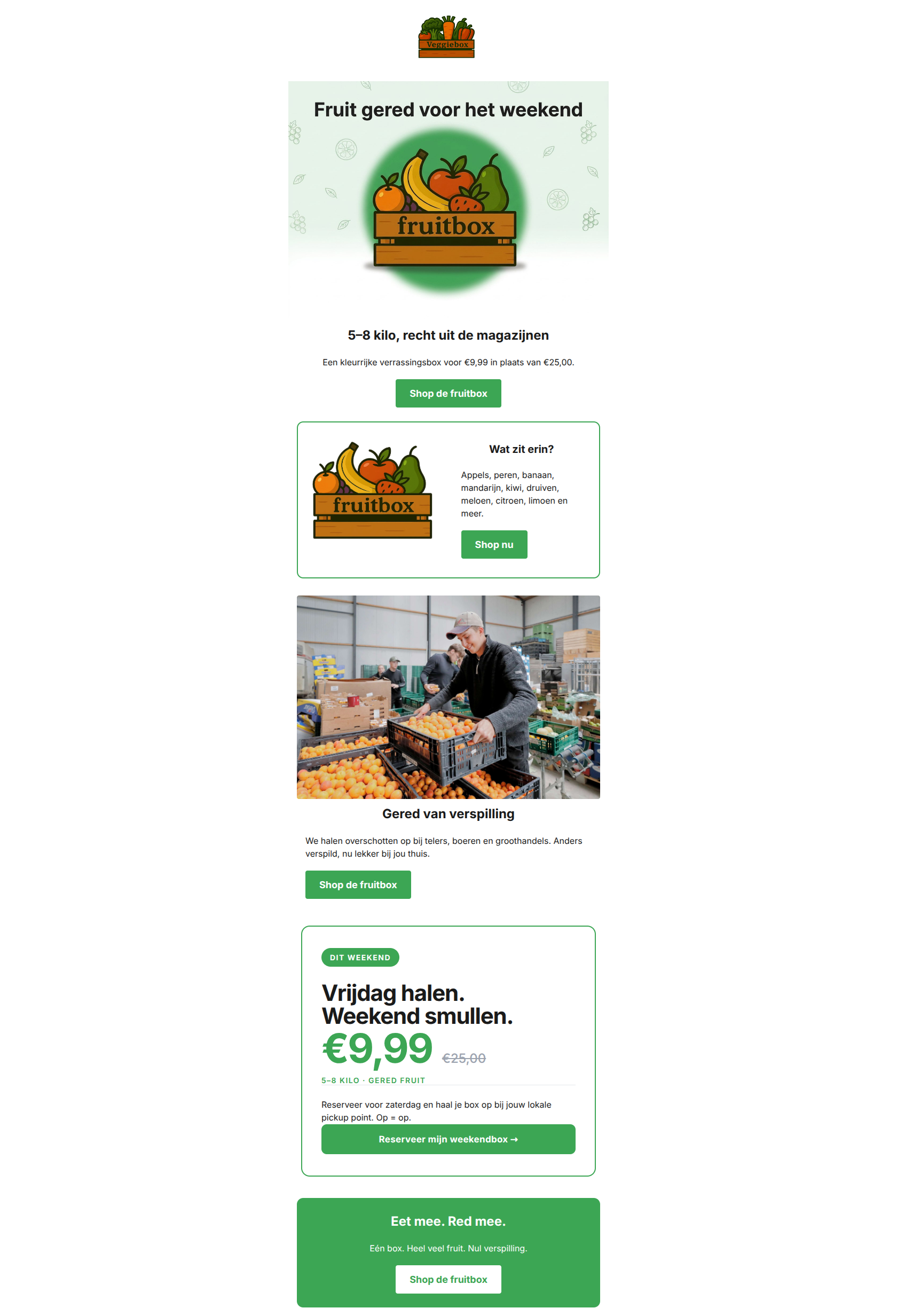
88/100This is a highly effective, tightly constructed promotional email that nails its primary objective. The value proposition (€9.99 for 5-8 kilos) is front-and-center, the copy is remarkably concise, and the primary call-to-action is repeated perfectly without dilution. The email's conversion bridge is exceptionally strong. The main areas for refinement are visual—specifically, replacing overly detailed illustrations with clearer imagery and avoiding text locked inside hero images.
Create Your Own
Generate professional email designs like this one in seconds with Kopi AI.
Email Details
- Subject Line
- 5–8 kilo gered fruit voor €9,99
- Brand
- Veggiebox
- Industry
- Food & Beverage
- Email Type
- Promotional
- Created
- May 19, 2026
Brand Colors
Email Copy
5–8 kilo, recht uit de magazijnen
Een kleurrijke verrassingsbox voor €9,99 in plaats van €25,00.
→ Shop de fruitbox
Wat zit erin?
Appels, peren, banaan, mandarijn, kiwi, druiven, meloen, citroen, limoen en meer.
→ Shop nu
Gered van verspilling
We halen overschotten op bij telers, boeren en groothandels. Anders verspild, nu lekker bij jou thuis.
→ Shop de fruitbox
Eet mee. Red mee.
Eén box. Heel veel fruit. Nul verspilling.
→ Shop de fruitbox
Why This Email Works
This is a highly effective, tightly constructed promotional email that nails its primary objective. The value proposition (€9.99 for 5-8 kilos) is front-and-center, the copy is remarkably concise, and the primary call-to-action is repeated perfectly without dilution. The email's conversion bridge is exceptionally strong. The main areas for refinement are visual—specifically, replacing overly detailed illustrations with clearer imagery and avoiding text locked inside hero images.
Hero Impact
90/100- Extremely clear and compelling value proposition right at the top.
- Zero throat-clearing; gets straight to the offer.
- Visual perfectly supports the product.
Content Structure & Flow
88/100- Logical progression from hook to detail to urgency.
- Sections are clearly delineated by subtle background color changes.
- Ends on a strong recap of the core offer.
Visual Hierarchy & Layout
78/100- Excellent use of whitespace.
- Primary CTAs visually dominate the hierarchy.
- Text blocks are kept narrow and digestible.
Call-to-Action Strength
95/100- Flawless repetition of the primary conversion goal.
- High-contrast button design that stands out from the background.
- Clear, action-oriented button copy.
Message Clarity & Tone
90/100- Great phrasing: 'Te mooi voor de prullenbak, te lekker om te missen.'
- Transparent pricing comparison ('Normaal €25,00').
- Action-oriented tone throughout.
Readability & Scannability
85/100- Excellent color contrast on all text elements.
- Headings are clear and distinct from body copy.
- Short, punchy sentences.
Offer & Value Proposition
92/100- Massive, clear discount (€9.99 vs €25.00).
- Tangible weight metric (5–8 kilo) makes the value real.
- Urgency ('Gered vóór het weekend') justifies the discount.
Personalization & Audience Fit
80/100- Appeals perfectly to both the wallet and the conscience of the target audience.
- Pragmatic tone fits the Dutch demographic.
Copy Conciseness & Word Economy
95/100- No filler phrases ('We are excited to announce...').
- Benefits are stated with absolute minimal word count.
- Copy serves only to move the user to the next section or the CTA.
Quick Wins
- Update the link on the warehouse photo to point to the primary shopping destination rather than the 'About Us' page to prevent conversion leaks.
- Reformat the list of fruits in the second section into bullet points for faster scannability.
- Extract the text embedded in the hero illustration and render it as live HTML text for better clarity and accessibility.


Create Professional Email Designs
Generate beautiful, on-brand email designs in seconds. Just enter your brand URL and let AI do the rest.