Beauty & Skincare Promotional Email Template
“30% off everything starts right now.”
Design Score
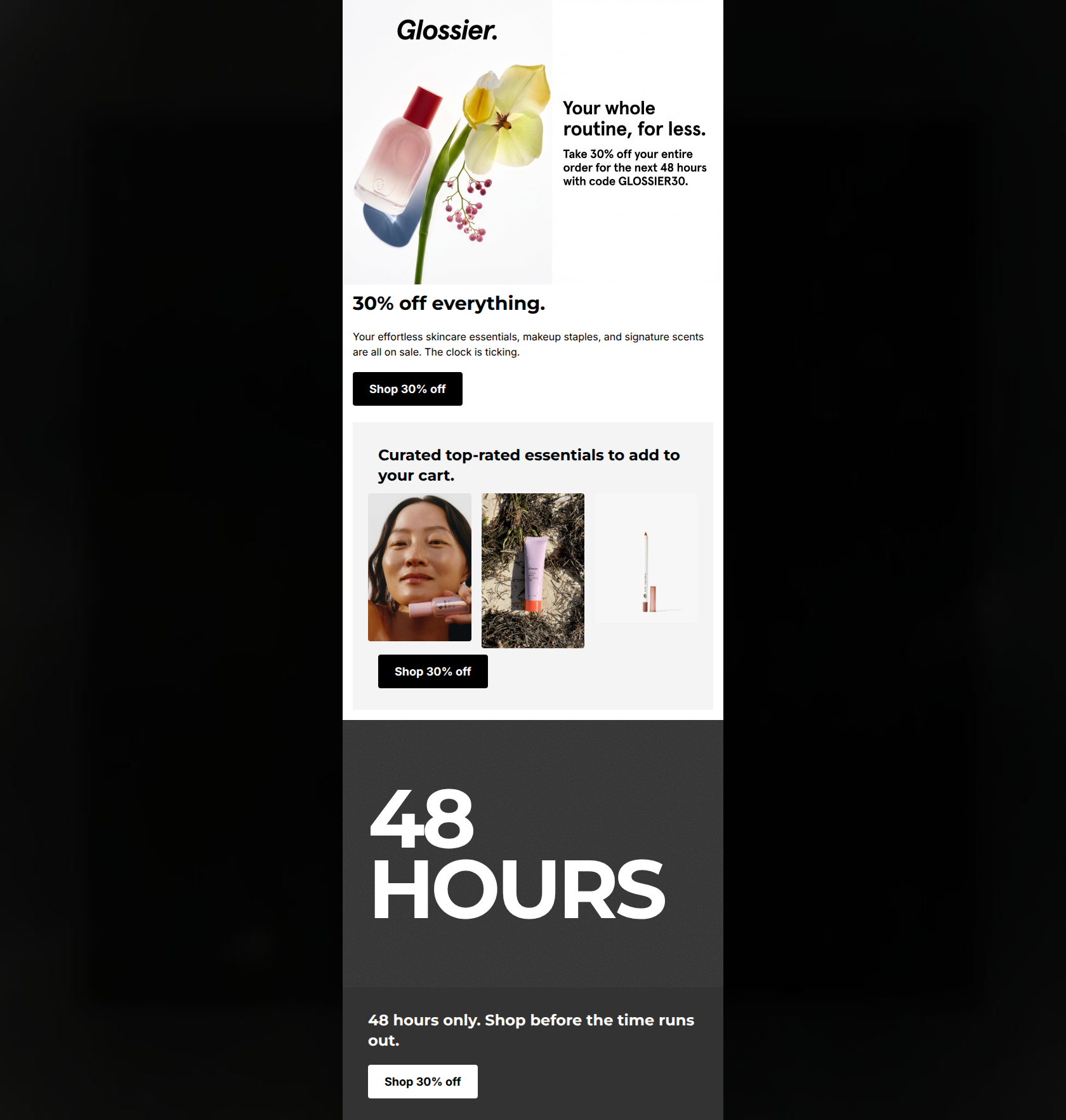
50/100CRITICAL FAILURE: The product grid in the middle section completely omits core commercial information, lacking both product names and prices. This creates massive friction for shoppers and strictly caps the email's score at 50. Beyond this fatal flaw, while the 30% off sitewide offer is strong and the stark visual style aligns well with Glossier's minimal aesthetic, the execution is sloppy. The essential promo code (GLOSSIER30) is trapped inside the hero image rather than being provided as copyable live text. Furthermore, the messaging is highly repetitive, hammering '48 hours' and 'Shop 30% off' multiple times without offering new value, contextual product details, or clear click paths.
Create Your Own
Generate professional email designs like this one in seconds with Kopi AI.
Email Details
- Subject Line
- 30% off everything starts right now.
- Brand
- Glossier [eval 2026-03-21]
- Industry
- Beauty & Skincare
- Email Type
- Promotional
- Created
- March 21, 2026
Brand Colors
Email Copy
30% off everything.
Your effortless skincare essentials, makeup staples, and signature scents are all on sale. The clock is ticking.
→ Shop 30% off
Curated top-rated essentials to add to your cart.
→ Shop 30% off
48 hours only. Shop before the time runs out.
→ Shop 30% off
Why This Email Works
CRITICAL FAILURE: The product grid in the middle section completely omits core commercial information, lacking both product names and prices. This creates massive friction for shoppers and strictly caps the email's score at 50. Beyond this fatal flaw, while the 30% off sitewide offer is strong and the stark visual style aligns well with Glossier's minimal aesthetic, the execution is sloppy. The essential promo code (GLOSSIER30) is trapped inside the hero image rather than being provided as copyable live text. Furthermore, the messaging is highly repetitive, hammering '48 hours' and 'Shop 30% off' multiple times without offering new value, contextual product details, or clear click paths.
Hero (top/initial part) Impact
60/100- Headline is immediate, clear, and sets the stakes right away.
- Photography styling feels authentic to Glossier's 'raw' and 'editorial' brand identity.
Content Structure & Flow
45/100- Clear progression from a global offer down to specific category/product suggestions.
Visual Hierarchy & Layout
60/100- Excellent high-contrast execution aligns with the brand's 'anti-design' and raw aesthetic.
- Distinct section backgrounds (white, grey, charcoal) clearly demarcate different zones.
Call-to-Action Strength
50/100- Buttons stand out flawlessly against both light and dark backgrounds due to stark color contrast.
- Left-aligned placement creates a predictable and easily scannable path for the eye.
Message Clarity & Tone
65/100- Tone is unpretentious and direct, treating the customer like a peer.
- Short, punchy sentences cater perfectly to skimming behavior.
Readability & Scannability
70/100- High-contrast text on solid backgrounds passes all visual accessibility heuristics.
- Paragraphs are kept brief, avoiding walls of text.
Offer & Value Proposition
40/100- 30% off is an aggressive, clear, and highly motivating blanket discount.
Personalization & Audience Fit
60/100- Visual aesthetic and direct tone resonate strongly with the target demographic's psychographics.
Quick Wins
- Extract the promo code 'GLOSSIER30' from the image and place it in a prominent, live-text block near the primary CTA.
- Add product names, original prices, and sale prices directly below the three images in the middle section.
- Update the middle section's CTA copy to 'Shop Best Sellers' to differentiate it and align with the link destination.

Create Professional Email Designs
Generate beautiful, on-brand email designs in seconds. Just enter your brand URL and let AI do the rest.