Beauty & Skincare Promotional Email Template
“30% off everything. 48 hours only.”
Design Score
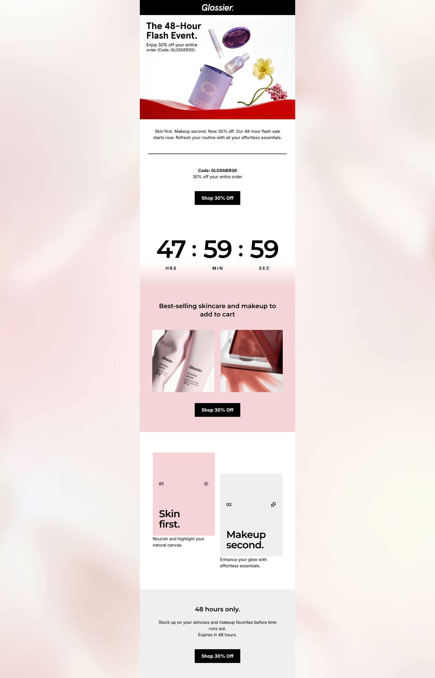
75/100This is a competent, visually striking promotional email that leans heavily into Glossier's signature minimalist aesthetic. The 30% off offer is strong and immediately apparent, and the bold black typography against light backgrounds ensures excellent readability. However, the email relies too heavily on repetitive, purely transactional CTAs ('Shop 30% Off') and completely abandons the brand's trademark conversational, 'cool older sister' voice in favor of generic sale copy. While it will drive clicks based on the strength of the offer and brand recognition alone, optimizing the layout to reduce friction (like grouping specific product categories) and injecting more personality would elevate it from good to excellent.
Create Your Own
Generate professional email designs like this one in seconds with Kopi AI.
Email Details
- Subject Line
- 30% off everything. 48 hours only.
- Brand
- Glossier [eval 2026-03-21]
- Industry
- Beauty & Skincare
- Email Type
- Promotional
- Created
- March 21, 2026
Brand Colors
Email Copy
Skin first. Makeup second. Now 30% off. Our 48-hour flash sale starts now. Refresh your routine with all your effortless essentials.
Code: GLOSSIER30 30% off your entire order
→ Shop 30% Off
Best-selling skincare and makeup to add to cart
→ Shop 30% Off
48 hours only.
Stock up on your skincare and makeup favorites before time runs out. Expires in 48 hours.
→ Shop 30% Off
Why This Email Works
This is a competent, visually striking promotional email that leans heavily into Glossier's signature minimalist aesthetic. The 30% off offer is strong and immediately apparent, and the bold black typography against light backgrounds ensures excellent readability. However, the email relies too heavily on repetitive, purely transactional CTAs ('Shop 30% Off') and completely abandons the brand's trademark conversational, 'cool older sister' voice in favor of generic sale copy. While it will drive clicks based on the strength of the offer and brand recognition alone, optimizing the layout to reduce friction (like grouping specific product categories) and injecting more personality would elevate it from good to excellent.
Hero (top/initial part) Impact
75/100- Immediate clarity on the offer (30% off).
- Strong use of brand-aligned visual assets right at the top.
Content Structure & Flow
80/100- Logical progression from offer introduction to urgency and product showcasing.
- Breathing room between sections makes the email feel uncluttered.
Visual Hierarchy & Layout
78/100- Black buttons on light backgrounds create unmistakable focal points.
- Bold, sans-serif typography establishes clear section headers.
Call-to-Action Strength
68/100- High-contrast black buttons are impossible to miss.
- Adequate spacing around buttons prevents misclicks.
Message Clarity & Tone
65/100- Zero ambiguity about what the sale is and how long it lasts.
- Short, punchy sentences make the copy easy to skim.
Readability & Scannability
85/100- Excellent contrast ratios throughout the text.
- Clear hierarchy with headings distinctly larger than body copy.
Offer & Value Proposition
90/100- Highly compelling, straightforward offer.
- 'Entire order' phrasing removes mental math for the customer.
Personalization & Audience Fit
60/100- Visuals and photography align perfectly with the target demographic's preference for raw, authentic imagery.
Quick Wins
- Change the secondary and tertiary button copy to contextual actions (e.g., 'Shop Bestsellers') instead of repeating 'Shop 30% Off'.
- Replace the background gradient with a solid #F4D4D4 or #EFEFEF color block to match the brand's crisp editorial style.
- Left-align the brief body copy under the main hero header for better readability.

Create Professional Email Designs
Generate beautiful, on-brand email designs in seconds. Just enter your brand URL and let AI do the rest.