Food & Beverage Promotional Email Template
“🔥 15% Off: Dare to Try Damnation?”
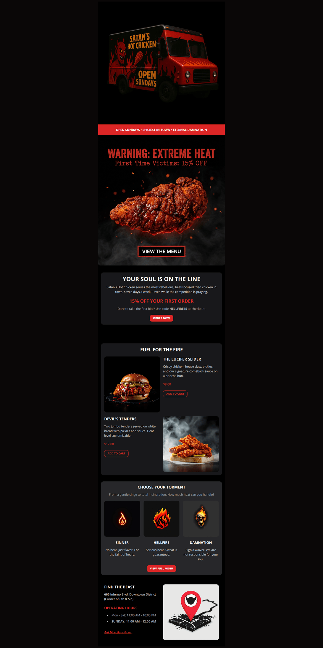
Design Score
82/100This email brilliantly executes the brand's 'hell-themed' rebellious identity with strong visual hierarchy and sharp copywriting. While the dark-mode aesthetic and narrative flow are excellent, the Hero section suffers from redundant information (text burned into the image vs. HTML text) and a 'false button' visual that dilutes the primary CTA. Minor adjustments to image composition and offer placement will significantly sharpen the conversion path.
Create Your Own
Generate professional email designs like this one in seconds with Kopi AI.
Email Details
- Subject Line
- 🔥 15% Off: Dare to Try Damnation?
- Brand
- Satan's Hot Chicken
- Industry
- Food & Beverage
- Email Type
- Promotional
- Created
- November 23, 2025
Brand Colors
Email Copy
OPEN SUNDAYS • SPICIEST IN TOWN • ETERNAL DAMNATION
YOUR SOUL IS ON THE LINE
Satan's Hot Chicken serves the most rebellious, heat-focused fried chicken in town, seven days a week—even while the competition is praying.
15% OFF YOUR FIRST ORDER
Dare to take the first bite? Use code HELLFIRE15 at checkout.
→ ORDER NOW
FUEL FOR THE FIRE
THE LUCIFER SLIDER
Crispy chicken, house slaw, pickles, and our signature comeback sauce on a brioche bun.
$8.00
→ ADD TO CART
DEVIL'S TENDERS
Two jumbo tenders served on white bread with pickles and sauce. Heat level customizable.
$12.00
→ ADD TO CART
CHOOSE YOUR TORMENT
From a gentle singe to total incineration. How much heat can you handle?
SINNER
No heat, just flavor. For the faint of heart.
HELLFIRE
Serious heat. Sweat is guaranteed.
DAMNATION
Sign a waiver. We are not responsible for your soul.
→ VIEW FULL MENU
FIND THE BEAST
666 Inferno Blvd, Downtown District (Corner of 6th & Sin)
OPERATING HOURS
- Mon - Sat: 11:00 AM - 10:00 PM
- SUNDAY: 11:00 AM - 12:00 AM
Get Directions →
Why This Email Works
This email brilliantly executes the brand's 'hell-themed' rebellious identity with strong visual hierarchy and sharp copywriting. While the dark-mode aesthetic and narrative flow are excellent, the Hero section suffers from redundant information (text burned into the image vs. HTML text) and a 'false button' visual that dilutes the primary CTA. Minor adjustments to image composition and offer placement will significantly sharpen the conversion path.
Hero (top/initial part) Impact
75/100- The 'Open Sundays' ticker bar is an excellent use of space that immediately reinforces the brand's unique selling proposition.
- High-quality, appetizing imagery that fits the dark aesthetic perfectly.
Content Structure & Flow
90/100- The 'Choose Your Torment' section effectively educates users on the product range without feeling like a boring instructional block.
- The zig-zag layout in the menu section keeps the eye moving down the page.
Visual Hierarchy & Layout
85/100- Effective use of the primary red color (`#dc2626`) to guide the eye to key actions and prices.
- Excellent use of 'zig-zag' layout (alternating image/text) in the menu section to reduce visual fatigue.
Call-to-Action Strength
70/100- The main 'ORDER NOW' button uses high-contrast red against the dark card, making it pop.
- The secondary 'View Full Menu' button provides a clear alternative path for users not interested in the specific featured items.
Message Clarity & Tone
95/100- The 'Operating Hours' section copy ('Yes, we are open on Sundays') explicitly addresses the competitor differentiator with humor.
- Heat level descriptions ('Friendly burn' vs 'Sign a waiver') make product selection fun and intuitive.
Readability & Scannability
85/100- Headlines are short, punchy, and easy to scan.
- Bullet points and short paragraphs prevent 'wall of text' issues.
Offer & Value Proposition
90/100- The 'First Time Victims' framing makes the discount feel exclusive to new subscribers.
- Clear pricing on individual items sets immediate expectations.
Personalization & Audience Fit
65/100- The content is perfectly tailored to the 'heat seeker' psychographic.
- The 'First Time Victims' language effectively segments the audience as new subscribers.
Quick Wins
- Remove the 'VIEW THE MENU' button graphic and '15% OFF' text from the Hero image source file to prevent redundancy with the actual HTML content.
- Bold the Sunday operating hours in the footer even more prominently (perhaps change text color to brand red) to reinforce the USP.
- Change 'ADD TO CART' button labels to 'ORDER NOW' if the link directs to a general menu page rather than a cart action.


Create Professional Email Designs
Generate beautiful, on-brand email designs in seconds. Just enter your brand URL and let AI do the rest.